Colour swatches
Posted by Robyn Russell at 08:04 Labels: OUGD201, What is good project Saturday, 30 October 2010Here i have created some basic colour swatches. They don't match the colours exactly as they are neon but it just helps get a basis of what i would be working with and what to design around. I will get real samples once my paints have arrived and i can test them out properly. I will be restricting my colour palette to 3 colours plus stock so i won't be using all of these, but its good to see what works and what doesn't. I chose i black background to put my colours against because i wanted to see how they would work, and it makes the colours stand out that much more.
I am starting to now design my project, seeing as my project is going to be very type heavy its imperative that i pick a correct type face to work with. I need it to be transferable across the concepts that i am doing, which are the toilet roll concept and the billboard range idea.
My designs are going to differ in size, for example the toilet roll idea is going to be quite small whereas the billboard idea is going to be large, so i need to have a type face that will remain clear and legible no matter what size it will be. I also need the type face to be appropriate to the project i'm doing, i don't want it to give off connotations of seedyness, i need to the actual text to relay that. I don't want to bombard people with this sort of information and scare them off and lay the message on too heavily or they will just turn away.
So, in order to get an idea of what's appropriate i have been looking through the research i have done of the packaging designs and viral marketing, and all the type faces are generally using a helvetica/ariel type face. So i then decided to look into the type faces myself and have pulled examples of it. Personally i have chosen, to work with helvetica. Its clear and works well in across all forms, eg. bold, italic etc. Its a versatile type face that can be edited to fit a different purpose.
"Wrap it up" FINAL NETS
Posted by Robyn Russell at 08:32 Labels: OUGD201, What is good project Monday, 18 October 2010Overall i am really happy with my NET designs. I think they work well as a range.
I am happy with the choice of colour and type, they compliment each well. My
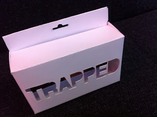
favorite has to be the special packaging, the trapped box. It works well on
so many levels and the type is big enough for you to see through it
and see the image clearly.
Here i have tried the idea of looking through the box and seeing the image inside. I think it would work quite well. The type would be cut out, and you would view the image through it as if it were a peep hole camera. i really like this design and im going to make a mock up and see what it looks like in 3D before i settle on this idea.
For this project I decided to dress my house mate up as
a trafficked victim. I then wanted to take pictures of her in a seedy area
which so happened to be my house and the surrounding estate.... All the pictures
worked really well the only problem was some looked to scary. The ones where
she looked more vulnerable worked better because you instantly
feel more sympathetic. My personal favorites are the ones where she is under
the stairs. I think are the most effective, because thats more realistic. By looking at her
you can feel her pain, and you do feel disgusted and shocked, which is what i was going for.
I will be using these images for my project, but i will be using the ones that make her look
more vulnerable and lost.
Subscribe to:
Comments (Atom)


