I have photographed the production of my posters from print to cutting them down. I placed all the crop marks on the prints so that when it came to it i could get an exact A2 board. This is a similar process that would happen in a print production house, they employ a team of people to guillotine down the designs except they just do it on a much larger scale. The posters would be printed through the lythography machine then sent to the guillotines to be trimmed down to size. This process increases the reliability of the prints and the accuracy of size which is very important. I am very happy with how my posters have been printed and produced i think they work well as a range and each on individually, they compliment each other.
Poster production
Posted by Robyn Russell at 15:05 Labels: 2nd Year, What is good project Tuesday, 16 November 2010Logo - Foil Stamping process
Posted by Robyn Russell at 14:58 Labels: 2nd Year, What is good projectI decided a while back that there may be a possibility of foil stamping the logo. So i decided to give it a go before i tried it on the posters themselves. I photographed the whole process to remind me what to do if it did work and if not then i could remember what the process would be in the future.
HEAT UP TO 150°
LAYER FOIL OVER THE DESIGN
HOLD DOWN FOR 12 SECOUNDS
REMOVE AND WAIT TILL COOL
WAIT TILL COOL
GENTLY PULL BACK DESIGN
REMAINS OF DESIGN ON FOIL - BECOMES SEE THROUGH
As the foil sticks to the dark parts of the design
This time the images were too dark and so the foil stuck to the
whole of the design pretty much, nothing is legible in the top design,
but int he bottom because of the white outline you can see the LAST.
But the rest of the information is unclear, which isnt what i wanted at
all.
Here is the comparison with the printed design
and then the foil stamped design, image was too dark.
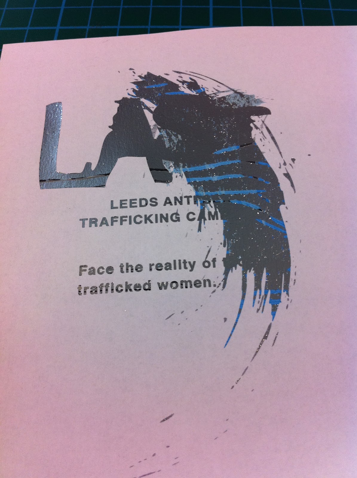
First design too much foil got stuck to the design
and made it very unclear and you cant pick out any detail.
The logo shows up better on this design but
again the text cant be seen, need to create a lighter design.
re printed with colour and a lighter design.
This time it worked except there was still
some remains of the foil on bits of the design
which did ruin it a bit, but nothing a bit of
photoshop can't fix! I do really like how there
is a ripple affect across the LAST logo itself, it
immediately draws the eye and makes it visually
engaging.
I won't be using this process for my boards or any of my designs, i don't think it gives off the right desired effect. The stamping makes the logo look very 'glitzy' which isnt exactly helping me promote the seediness and the disgusting(ness) of the sex trafficking industry.
Having said that it has been a really good learning curve and although i wont be using it within my project it has helped me realise i can use it in future projects and by doing it step by step i am not likely to forget how to do it. Just as long as the images arn't too dark because the foil will print on them!
Final Packaging Mock Ups For Boards
Posted by Robyn Russell at 14:52 Labels: 2nd Year, What is good projectHere i have taken images of my mock ups for the presentation boards for wednesday and the following tuesday. I want my final images to start taking on a more professional look and feel to them. With these images I have photoshopped them to make them look a little more professional. They work as an idea for the mock up presentation boards but i think when it comes to my final boards then i am going to have to to remove all the hard edges and white lines so they look like a final product. Over all i am happy with what i have created and i think the mock ups work well and are effective in showing what i want them to, when being viewed in the public eye and how they would be marketed.
Toilet Roll - Photoshopping take 2......
Posted by Robyn Russell at 14:50 Labels: 2nd Year, What is good projectAfter printing my mock up designs off and making them i then placed toilet roll inside them in order to put them into context, these were made for the presentation boards i have to design. So once printed and photographed the next stage is to photoshop the text. the problem is i really couldn't get my head around the software in order to get it to work, if anything the images i created are worse than my first attempt. I think this is because they are an awkward angle, and it will work better face on instead of at the side. The text just doesn't seem to blend with the photograph so it just looks like text had been stuck on top.
This is turning out to be quite a large problem, and making me very determined to try and screen print on the toilet roll!
I don't want to leave this idea, i am going to do my best to get it to work, the problem it by using my photoshop skills its making my product look very unprofessional which is the most annoying thing because i am trying to really get my work to have that professional feel about it.
Packaging Substrate - Satin and Gloss
Posted by Robyn Russell at 14:50 Labels: 2nd Year, What is good projectI wanted to try my packaging on other substrates to see what i would look like. The only problem is I can't physically print double sided on Satin or Gloss at UNi, because it will take roughly a year for the ink to dry on the other side. And i would have to print double sided in order to get that black interior.
It is also very expensive to print onto satin and gloss double sided if i were to do it in a mass produced way as it costs roughly £20 per sheet and for what i wanted to do it is way too expensive and i couldn't justify spending that amount.
PRINTING
PRINTING
PRINTING
SATIN PRINT
Satin
SATIN
SATIN
GLOSS PRINT
GLOSS PRINT
GLOSS PRINT
Gloss
GLOSS Vs. SATIN
Above are the examples of what i would want to print, and i do think they look a lot better than the matt print outs, that added shine just gives more the the colours and design work. I think if i were to print in one of these two stocks it would be the SATIN. This is because the gloss is way to bright, when the light shines on it you loose a lot of the message and information. Compared to the Satin where when the light hits it, it seems to dissipate and disperse across the substrate. So it does make it shine but you dont loose any of the vital information or the design work, and it just adds another level to the piece which is essentially what i wanted to do.
PRINTED NET
PRINTED NET - Checking measurments
CUTTING
I have photographed the process of creating my nets and how the net began to take shape. if this process were to be done in a mass produced way then the design would be printed and then the image cut using the dye cutting machine. The design would then hand folded, creating the net. Much the same as the process that happens at TEAM, when we went to visit i kept a special eye out for the processes i would use in order to make my products. They had a team of employees that hand folded all the designs that needed it. This would be quite expensive but for the fact the print process for the nets itself is quite cheap then this added technique insures quality and a hand felt approach to it, which is exactly what i want.
Check measurements once finished
SCORING
SCORING for folding
Subscribe to:
Posts (Atom)