Visual Language

Friday, 20 November 2009

Today we were looking at physically making the contrasting colour. We had to collect 1 sheet of coloured paper for each colour and cut out a 10x10 square for each. We then had to cut out more squares and then cut them into 5x5, We then placed these on a white piece of paper so as to not distract from the other colours as we layered them up. We were then told to place specific squares on each square and see the reaction. Within this session we took a lot of photographs so what i have done is take 10 examples from each part of the session and discuss them briefly.
Original stack of paper. Just showing what we had to do.
the blue and red show contrast while the green and red show complimentary - this shows a secondary with a primary, primary colour will always stand out and if you get two primarys (red and blue) then they will fight.
Nothing happens with these colours they are completely flat as there is no contraast.
With this you'd expect to see the colours fight which they do a bit but the black controls them so it stops the colours fighting and bouncing.
With the yellow on black the yellow holds down and makes it flatter. Wherteas with black on yellow makes the yellow look brighter.
This image shows neutrality, the squares aren't bouncing. Colours look flat.
With this the red looks darker and the orange warms up.
The orange begins to look lighter because of the yellow sqaure.
Shows neutrality, white doesn't bring or take anything away.

The black makes it looks like its being sucked down with the green just surrounding it.

After this we then cut out arrows and did a similar exercise but this time looking more at associations. I have chosen 5 of the images that i think were best.


These are the set of arrows that i cut out in different sizes and shapes to help with variation.
the red on black makes the red appear darker and gives a sense of danger.
The red on yellow shows neautrality and doesn't look too dark. gives a sort of pleasing image.
This looks like a warning sign with the association of red and white.
Here we were trying out what a lot of colour on another would do to one another, here it shows that the colours rally fight against one another because of the fact they are two primaries.

Visual Language - Colour Lecture 2.

With this weeks colour lecture, we were looking at colour and contrast. this is based on the hue of the colour and the dimensions within those colours. It was also looking at colours in relation to one another and how the effect one another. We were told a few sentances about colour that would help us understand when talking about contrast:

Contrast of tone. formed by the juxtaposition of light and dark values. This could be monochromatic.

Also when the tone og two colours are simila it mean their tonal contrast is lower - this is because they are similar.

Contrast of Hue. Formed by the juxtaposing of different hues. The greater the distance between hues on a colour wheel, the greater the contrast.

Contrast of saturation. Formed by the juxtaposition of light and dark values and their relative saturations.

Contrast of extension. Formed by assigning proportional field sizes in relation to the visual weight of a colour. also known as the contrast proportion.

Contrast of temperature. Formed by juxtaposing hues that can be considered warm or 'cool'. Also known as the contrast of warm and cool.

After the lecture we then had to create a circle in the room with all the objects we had used in the previous week going form one colour to another.


After we had done this we then had to take our objects and place them on different coloured card to establish the impact these colours made on the object. We took a lot of photos and then had to pick 10 of the images that we thought had the most impact on the pobjects.


No News is Good News... Brief - Final Designs

Thursday, 19 November 2009

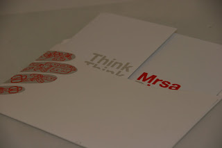
Below shows images of my final piece. It shows the envelope design, and inside design working together to give an idea of how they would unfold etc.


No News is Good News... Brief - Part 2 Development

Monday, 16 November 2009

We had a crit on thursday and by then i had all my initial ideas on content and envelope design but needed to discuss ideas about envelope layout. I got feedback suggesting doing a small fold out. with this in mind i began development work on the layout. All the feedback from the crit can be found on my PPD blog.

Development for fold out:
I began by looking at the width of the envelope to gage how wide my design could actually be. I did some designs before which were A3 fold outs and they just looked too messy, there were too many creases all over the page. Didn't look professional enough. So I then began with just working with a strip. I tried different layouts to see what would work.


To the left shows some of my working out but the rest is in my work folder. It just shows example of how i worked with the a3 and then on a smaller scale, messing around with layout and seeing what works best so that i could then go onto illustrator and try out different looks.

I decided to go with fold over effect. I think this idea works well because it opens like a card and then has the 'horrible' message. The next stage was to look at where the content would fit into the layout - for this I tried out a whole load of different examples, on illustrator and then mad physical examples. With the physical examples this helped me get a look at the real outcome and make alterations on a real scale which gave me more areas to look at and improve.
1.This is the original image just showing where the layout for the weekly calendar would be. i wanted it on the right hand side so it would be the last thing you saw as you peeled it open, this then adds to the message.
2.This has all the content on the page with the main message written along the top. This is too small and I don't think it really shows the message in the best way. Having said that i like where the calendar/web address is and the weekly calendar on the right. I want the message to be in the middle to draw attention to it.
3. This is one of my favorite designs. This is because the message is large and readable. it mimics the original poster text too. i also think on some levels it works as a greetings card, all be it a horrible greetings card - but the way you open it up works as if you were opening a Christmas/birthday card with the text placed in the middle.
4. This is a bad layout and design. You can't read the message and doesn't function well as you open it. there is no impact whatsoever just confusion.


5. This has the original idea of having a cut off section. although this looks good the idea behind it has gone as i have changed it slightly so there is no need for a cut off section anymore - also the text is illegible too.

I chose the 3rd layout because it utilizes the dead space in the middle. It catches your eye when you open it and the message gets across straight away. Its simple and effective.

I was also looking at the development for my envelope. This was fairly simple to develop - I sketched around my hand then places the files in illustrator and added the same style to the fingers that is on the original poster ( blocked out hand with the bacteria all over it).


I really think this works well, especially when you think about a postman carrying it not knowing what it means unless you open it. the envelope makes you think and want to read more. I like the just having the address on with the hand print i think this is very simple and doesn't detract from the hand in anyway and vise versa.