This section is purely focusing on the outside design for my envelopes if i chose to do and envelope. I have tried a variety of different things incorporating as much or as little of the previous poster designs as possible. I tried out a lot of different combinations and instead of discussing all of them i have picked 3 that i like or don't like from each sheet.
 Envelope:
2. Personally i don't like this design because there is too much going on. The envelope just looks too complicated, and messy. I tried it smaller but it just lost its definition and looked more squished (or as polly put it sqaushdulated).
6. Here i was trying to experiment with the larger message 'think MRSA etc'. I also tried blocking out where the stamp went to help show where it would go on the envelope. I don't like this design as much as others, i think that the message being so large really detracts from the mailing address which doesn't work as a mail shot.
7. I altered the size of the message and just used an outline from the stamp. I think this works quite well. Its still simple and nothing detracts from the mailing address. this could be a possibility to use for my future development.
 Envelope:
 Envelope:
2. O really quite like all the hand designs - i like the idea of having a hand print on the envelope where you would hold it/carry it. With the second design i think maybe the hand is too much especially with the thick outline for the stamp.
4. This is a minimal design with it just showing the finger tips prints. I think the idea works but needs more developing to make it smoother and more professional.
6. This is a similar design to the 2nd one except I have taken out the stand and moved the hand slightly. it works better than the second but still needs more work.


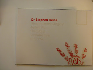
 Here i have tried to make the envelopes roughly to see what they will look like. The writing is quite pale and i think that the red writing for the address works better than the pale. Also the hand works quite well now that its printed properly with the pale actually making it not so obvious. I still prefer the design where the whole hand isn't on the design. I think it is more aesthetically please and visually works well.
 There is still a lot of development i need to do but generally i am happy with the style of the envelope and where i will be going with it next.

0 comments:
Post a Comment