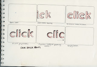
Today i did some test work with my word click. After spending a bit of time on disperse i wanted to try a different word just to keep the ideas flowing. This is very simple compared to what i did to disperse, but then i wanted to keep click simple and easy to follow. Its is only a test run, and the colours arn't right nor is the composition in my eyes, but it has the basic effect that i want it to have. I think the concept works with the idea of click going into itself and looking like its been pushed, the second image works with this. But the first image is lacking something it doesn't quite look like a button yet, so i may actually put the word surrounded by a button to make it a little more obvious.
Original sketch of idea.
Screen Shot story board, pre production.
After effects work:


0 comments:
Post a Comment