we had our final crits on Monday, and i presented my mock up final piece and my animations. It went okay, i got the feedback that i had expect, the animations were the weakest part of my project but my packaging idea was good it just needed to be made better and/or have a more professional feel. There were strong bits coming through but some things needed to eb changed for the whole thing to work.
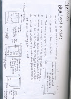
So i decided after having a talk with Fred, to redo my packaging. Not totally i would still use the images and the text idea but i wanted it to have a more realistic feel to it. So i decided on creating a box set, instead of just a fold out. I had DVD daces and all i needed to do was create information backs for them and a box. As i had used black heavily on the original packaging i thought it would be good to have an all black cover, and then print a sticker that was shiny so that it would reflect on the surface, and all that sticker would be. Yep you guessed it, a Batman silhouette. I started developing ideas for the back, i had seen some previous box sets with images on the cover of what was going on inside and i thought that would be a really good idea, so i picked some images and started playing around with the text, images and layout.
I wanted the layout to be the same across all the DVDs and the boxset itself, it thought it was very important to have a continuity to it, and i would get it with this. I need a design that was transferable. And by experimenting i settled on one, i did like the idea with the images along the side but when i tried to transfer it onto the other dvd boxes, it just left a lot of dead space which i thought looked rubbish.
The next stage was to put the whole product together, and get ready to submit it.


0 comments:
Post a Comment