The next and probably most vital part of my project was to work out the format in which my product would take. And thats what this section shows. I was struggling to break away fromthe Cardboy design as i had studied now thoroughly and i couldn't think of anything else that would work as well but i did not want to anything that related or resembled Cardboy. So i began looking for inspiration.
Firstly i began running through shapes, and more specifically 3D shapes. I thought about a prism and how it works. I prism made out of card would be a solid and stable structure. it would give a lot of room for information and there would be lots of room on the outside for me to do a variety of different illustration. I carried on thinking and was looking around the room when i saw a Prit Stick, the long cylinder stretched out gave me an idea or doing a body that would be round and then you could roll it out like scroll. It would be sturdy and would hold a lot of information, provided it worked. the only problem would be getting it to stand up squarely and fit together easily. And lastly when i got home i was looking at a variety of boxes i have lying around my apartment (image of these on DC), i took them apart to see how they worked and whether they needed glue etc. I came across my phone box, which didn't have any glue and it was a solid shape made of card. It was more of a box, but that meant there would be more room inside the product to store other things i.e pens, pencils etc.
Once i had done some very basic sketches of what i thought the box may look like i decided to do some more accurate drawings that included the illustrations to see which ones still really worked best on a bigger scale, even though i had already settled on the hoodies i wanted to see if that was the right decision. I decided to explore them on the prism and the cylinder, the box would be fairly easy to imagine.
In the end i decided to completely scrap the idea of making the illustrations look human, i didnt want that relatability and i decided to use the clouds as they were an inanimate object and a lot could be done with them in order to create characters within the piece, if i chose too. There is a lot i could do with this design and it isn't as restricted as the hoodies. Plus i was uncomfortable with the idea of generalising everyone and their styles some people may hate hoodies, and the simpler i make the design the more likely people will like it.
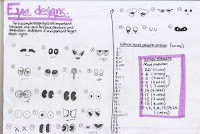
Once i had decided that i would use the clouds as my body designs, i needed to work out the eyes and facial features. In order to get the best i drew a variety of different eye and facial designs decided to walk around the class and ask them what they thought. The eyes on a body are one of the first thing the brain registers therefore its important that you get them right, because my illustrations are going to be simple and you will see them straight away. It was a really successful exercise doing this, i got a variety of answers but it helped me work out which eyes i could use and which ones i couldnt.


0 comments:
Post a Comment