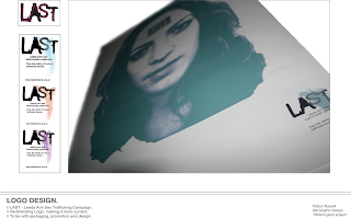
After coming away from my crit on wednesday it was clear to me that i needed to focus a lot more on the layout of the image and make them more professional looking. Make sure that the images looked right and really did respond to what was on the board. I still kept the same text, because we all felt it was appropriate to what was on the board and it didn't detract from the images it just helped put them into a bit more context.
I kept the same idea for the first board which was to have everything on it that i had created over the last few months. I wanted to show the relationship early on and really outline what the boards were about and what they were going to talk about. I felt that because the face image poster was so strong i really wanted that to be the first thing the viewer saw and that would draw you in to see what else the product was about and thats when you see the rest of the ideas. Again i have tried to keep it as simple as possible. This is probably the busiest board, it does have a lot going on but then over the next boards it all gets broken down so you can see more clearly what is going.

The second board is still focused on the logo design, and after talking to the crit group they suggested it would be a good idea to put the original logo on to help show where i have come from and i thought this was a great idea. It helps put the design more into context. I then decided that i didn't want to put too much development on the board of the actual logo because its not relevant to marketing the project so i decided instead to put an image of the logo actually working in situation. Again this really adds more depth to the piece and you gain sense of perspective because you can appreciate where its going and how it is being used. Although i decided to only use one product you can firstly, see it on other boards and secondly, i feel this image really does the logo justice.
The third board is still working on the billboard design concept. I have moved everything around again to help really illustrate the point and what is going on. I have decided to place the photoshopped images next to the illustrations because it puts the boards into more context and helps you understand their true placement in what would be their surrounding area. It also demonstrates what they would do in the real world, it just gives more depth and understanding to the images. This concept is solely based on hypotheticals so i was trying to be as clear as i could with this board.
The fourth board is all about the range of posters that are taken from the billboard idea. I re-took the photos of the UV print idea i feel the small spot like works a lot better than the overview photo i did before. This way picks out a lot more detail and really show the potential of printing in UV. I was also thinking of putting the posters into context by photoshopping them into a situation but because i had done that with the billboards and the range is really made for general use across a variety of areas i thought it best to show the viewer the range of posters instead of complicating it with images of where they could be put. Also because i show the detail with the UV paint i think it would have been too much having images of the posters in context too.
And lastly the fifth board which is all about the packaging product. I really do prefer the images i have taken of the toilet roll packaging and being able to use the screen printed toilet roll it really adds so much more to the images and helps see the context in which they would be put. I kept the images in black and white because i wanted them to be simple, but i also wanted to show the packaging colours so i decided to show the nets that i had created for the packaging and variety within them. This illustrates both my development and the final product that i have come up, essentially killing two birds with one stone. I think this board works very well its simple and there isn't too much going on but the colour in the nets really draws your eye in and makes you want to look at the board.
Generally i am very happy with the boards i have created. I feel each one does speak for itself and clearly states the processes that i have taken. The little information that is on them helps back up the images and vice versa. This is the first time i have done anything like this before and i feel for a first attempt i am happy with what i have produced.
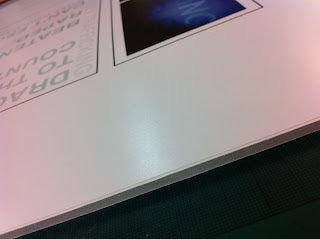
After printing the boards off onto satin, because i wanted them to have a certain shine to them to draw the eye and add a bit more to the colours, i then decided to mount them on foam board. This adds a bit more of a professional edge which is what i am trying to do with my work. I think they work really well mounted it gives them more of a structure and makes them more versatile when handling them.
Here are some close up images of me mounting my work and just showing the satin
look and the foam mount board.


0 comments:
Post a Comment