New Idea generation for the cup and the cupcake carrier. So far all the cups function is is to carrier a cupcake with an added napkin. Thinking about that now it is pretty boring, and after my crit there was a great idea to add a drinking element to it to again improve the functioning of the cup as well as increasing the novelty factor.
Here is the basic outline of the cup so far, and then with the added element
of the sachet. In order for it to appeal to a wider audience, instead of having complicated
drinks I thought I should bring it back to the basics, adding 2 novelty flavors:
TEA
HOT CHOCOLATE
CAPPUCCINO
COFFEE
This way there is pretty much something for everybody.
There will be a few tweaks that I will have to make after
creating this new element. For one I am going to have to
add a new price to the menu, but that shouldn't be too hard.
Another element to it is to maybe create a small vector
illustration that would outline the full function of the
cup. This can be promoted on the website and on the
packaging or menu. Or the cup itself.
Here are some initial sketches as to the sachet shape and style.
I really like the circular packaging, it goes with everything
else that I have done. I think the normal plain square may
be a little boring but the function of the square is good
because it fits a lot of stuff in it.
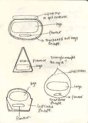
Here are some more sketched. I think my favorite
from this selection would be the top one, the bag that
would be shaped around the logo with a tear off section
along the top. This increase function and look.
Although theres been a lot with the logo so far im not
sure I want to do anything else around it.
This is a bit more of an in-depth idea of how
I would net out my square packaging. Excuse the crude drawings.
Colour selection for the packaging, this may change
but for now I am still working of the colour palette I have
already created. I want there to be continuity, this will
link with the branding of my company.


0 comments:
Post a Comment