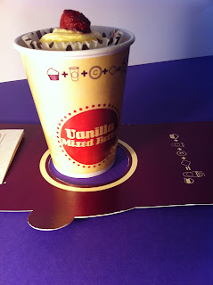
Seeing as there are two separate categories to the way my product is packaged i decided to take separate pictures of the packaging for the cup. I wanted to take pictures that would show its length as well as the the elements within it, again using the mock ups I had produced.
Here I have taken a shot of the whole packaging, now
while i like this I am not sure it shows the appropriate
amount of detail, it seems a little too far away, but you
can clearly see how it would function.
I decided to take a closer shot of the packaging and
cup so that you could see the way the cup is the center
and then the rest of the packaging folds around it. Although
you don't really get to appreciate the full scale.
I then took the same shot but focusing on the other
side so that you could see the icons clearly,
again though i think its a little too far away and therefore
some of the detail is lost with the icons.
I took a shot from a higher angle so you could
see the length. I think its too far away
so you can't really appreciate the details, its quite
hard to frame this in an attractive way.
I decided to take a shot of how the cup packaging
would form around the cup and how it is held in place,
I wanted to illustrate that you could clearly see the logo
on the bottom.
I then tried taking a length shot of the packaging
that would show both of the surrounding sides,
this turned out to be a much better show then the
ones i did by having it laid flat down, you can see
both of the detail quite clearly.
After taking some photographs of the packaging laid flat in order to put it into context i wanted to take some shots of it being held, after all this would be the main function of it. this way you can clearly see how it is being held up and how you can still see the interior of the packaging.
Here this angles is quite good because you see
the logo displayed below, as well as seeing the
interior colour. Although it is a little too dark so
the colour is lost, so i will need to keep this in
mind when re-photographing.
I then decided to try a slightly different angle,
this still displayed the logo but also clearly showed
the menu, which is an important part to the packaging
so i did want to highlight it in my packaging display.
This is just a slightly shaper angle. What i like about
this shot is showing the contrast of the white and purple interior,
how the stark difference is really apparent which is what I wanted.
Switching the camera around I then decided to
take a picture of the other side so that you could clearly
see the icons displayed on the interior. It clearly illustrates
that you can still see the icons and they are legible at a distance.
Again trying to get an angle of the packaging laid flat,
I think it works better with the cup being there because it
show the two elements being brought together. Although
again you cant really see the icons clearly.


0 comments:
Post a Comment