
Once i had done my categorizing i then went on to just start developing some initial ideas, i knew that i wanted to include the Batman Signal somehow, i really liked the shape and it was so transferable. This also meant that if i incorporated it within my designs then i could create a level of consistency. Also the Batman signal is universally accepted to represent Batman, so therefore it would be very clear to people what my product/packaging would be about. below shows the initial ideas i generated with their own evaluations.
 Idea 1. Really like the idea of projecting the Batman symbol onto objects and buildings. I think this is a good idea because it provides relatable imagery, people will look at it and instantly recognise that it is Batman. I also like the idea of trying to make it as if people had just stumbled across the signs, like when people take pictures of flying saucers etc.
 Idea 2 - I like this idea but not as a final piece i don't think. I need to develope it further but i think that it will be too boring and a little too generic, just moving a batman figurine. Having said that it is a good way to take my practice with final cut further and quicktime player. Idea 3 - This idea is quite boring, i think the concept is sound but i think that a 100 second animation of how to open a comic book would be pretty boring.
 Idea 4 - This idea is more of an idea that can help em with the rest of my project, by collecting the various pantones from different comic books will enable me to create a very good colour palette to work with, with future packing ideas and designs. This also means that no matter what my project fully relates back to Batman. This is another theme that can run throughout my project to give it that continuity.
 Idea 5 - This is a simple idea for the packaging, although it is quite a good idea there needs to be a lot more development with the content of my porject before i can take on the packaging because i need to work out what it is exactly i will be packaging, as i may be doing more than one dvd.
 Idea 6 - Typography animation idea. I really like this idea but the problem is i don't think i am skilled enough to work this one properly. I could do it hand drawn but i just think that it would look a little too messy. Another problem is that it doesn't directly involve the Batman sign which is something i want running throughout, again to add continuity. I think if i have more than one DVD then i need some continuity between each DVD in order for them to work as a set.
For the next stage I have experimented with two of the animation ideas (idea 2 and 6) this was just to see what they look like, below shows some of the original images and i have also posted the videos to the blog with an evaluation. 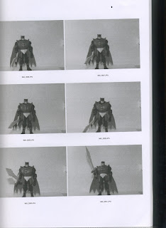 \
\
 \
\
0 comments:
Post a Comment