This is the second compress video I have created. I don't really like it. I like the concept behind it but the execution is defiantly lacking. Some parts of it work and some of it just don't at all. For example if you fast forward the video and watch between 00.02 and 00.04 the blocks falling onto the type works well because its clean and the type folds as the block hits it. However the first few blocks this doesn't work, this was because I was trying to work out the timing and how the type should fold. I didn't want it do just disappear behind the block once it had fallen because that doesn't really have anything to do with the type being compressed which was my original idea. I think this sequence would work over a longer time period, but because its a short animation it has to be very quick movements which wouldn't fully show what i wanted. In the future i am defiantly going to try and improve this because visually when it works it works quite well.
Compress 2 from Robyn Russell on Vimeo.
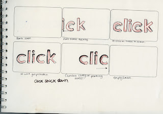
Again I have storyboarded the key frames within the sequence just to give a cleaner image of what I wanted to happen. Within this, whens its broken down you can really see where it works and where it doesn't work. This is actually a useful technique to use in the future, by breaking the animation down again you can see the frames that work and the weaker ones. Making it easier to fix if there is something wrong with the piece, especially if you are working across a time frame because the sequence will show you within which time frame it needs to be edited.
I started work on the word compress, i have done quite a few storyboards for this word because i really had no idea where to go with it apart from the most obvious answer's. So for this animation that is exactly what i did except i decided to change it up a bit. I wanted the word to change into another word and look seamless. I had also not done a lot of work with using Solid layers, and this animation gave me a chance to do that all be it very simply. I like the concept of the idea but i think the two type faces are too similar so when they second word pops up it doesn't actually give the contrast it needs to do in order to show and obvious difference. I think if i hadn't added the contrast in the background you wouldn't have seen the transition as clearly. Fundamentally i think the actual animation transition works because the type face size and format is exactly the same giving a clean change but there just isn't a big enough change in order for you to notice the difference.
Compress 2 from Robyn Russell on Vimeo.
I also decided to screen shot my animation to show the transition a little more clearly and what i am actually trying to do, you can also see with the original story board I haven't changed the concept too much which i think is important because i still want the animation to represent what is happening in the key frames i created. The sequence below is fairly simple and self explanatory.
Click 3 from Robyn Russell on Vimeo.
Again this is another animation for click. I went with the simplistic side again. I hadn't used much colour in my other animations so this was an opportunity to use a bit more colour and try a new idea. I wanted to keep using the cursor to try and make it look like when it went next to the letter it would then disappear. I did this changing the opacity and levels within the letters. I think it works really well, its quite seamless and looks authentic which is what i wanted. I think my ideas need to become a little more complex because i don't think these are pushing me that much but they are honing my skills with the basics of animation which is good.
Click 2 from Robyn Russell on Vimeo.
After my other animation, working with moving the cursor and then it changing. I decided to do this but a little simpler. I also took on the idea of changing the font as the cursor clicked. I kept the lines short and sharp, so that it would give more of the idea it was being clicked. I found that looking at the previous animation gave me some idea on how to improve the clicking motion with the cursor. I actually like this animation, its nothing spectacular but it works. I think the cursor could do with some adjusting to make it look more authentic, and i am not sure about the huge font it looks a little out of place.
Click from Robyn Russell on Vimeo.
After looking through my sketches from the story boards, i have mishmashed together a couple of ideas with this animation. The idea with this animation is to have the type corresponding with the mouse moving and stopping. I wanted it to look that as the mouse traveled it would 'click' and then the word 'click' would turn up but in a different style to the one before. This is a fairly simple idea, but it does work. I think the sequence itself moves too fast and i am not sure about the positioning of the some of the type in part of the sequence but as a whole you get the general idea. After i had looked at this i then began to think of different ideas that were similar, for example using the same arrow pattern but instead of the word changing size it would change to a different font. This could also work as if it started out in lower case and then went into upper case. Because this is such a simple idea it gives me a lot of scope to develop further. I am going to do some more storyboards that correspond to this development.
Untitled from Robyn Russell on Vimeo.
Untitled from Robyn Russell on Vimeo.
I edited my last video changing the opacity on the squares. I defiantly think the this works better, instead of it just being stuck on the screen. The screen actually clears and i think that this would work with the whole letter. I am going to try it with the whole letter next to clearly see how it would work. I was also thinking about looking into the perspective once i have this nailed so that i can then make the squares move bigger of the page, just like the Hulu opening sequence i looked at.
D from Robyn Russell on Vimeo.
Following our latest workshop in After Effects, i decided to try and apply what i have learnt to edit the words to fit what i am doing. I spoke to Mike about how i could possibly break up a word and he said to apply the selection tool to the letter and break it up on photoshop. So i decided to do this and then animate it in After effects using what we had learned. I only animated a small part of the letter as a trail to see how effective it would actually be. The squares when they break up are not all the same size which i think i would defiantly need to change, so that they were continuos. Another thing is when they all disperse i was trying to get them to go off the page, but instead they clumped at the side so i think that the next stage would be to change the opacity on the squares so that not only do they disperse as i designed them to but they would actually fade out of the sequence instead of remaining on the page.
HI from Robyn Russell on Vimeo.
HIA from Robyn Russell on Vimeo.
Today i created some more storyboards related to my words, based on the session we had with Fred. I PDF.ed them because i didn't want to scan them all into the blog and post them one by one this way they are more organized and you can see my thoughts. Again these sketches are pretty basic, as are the ideas but it is giving me a grounding within each word to expand on. As i work through them i am finding more and more that i really like the word disperse and click. They are a lot more interesting to work with and I have more ideas around them then compress. I want my designs to be simple, but at the same time interesting to look at and i feel further development in the initial designs will get me there. I still have more that i have been doing but these are my initial ideas.
In the next blog post i have selected and annotated my favorite designs from each of the words, these are the ideas i am going to take on further and develop and start looking into adding more frames in order to work out how the word would get there in the first place and how it would end, just like Fred suggested we do it. I really like employing this technique because it had helped me understand my words more and the process of creating storyboards. As well as the storyboards i have been practicing with After Effects and now working between the two you can really see how they work together, because the idea of creating something straight on after effects without having any idea of what it is i want to do is quite daunting as i don't know the software.
Today I had another attempt at creating an After Effects sequence. Again its really basic, but im going to keep trying with it because i don't want to forget how to use the software because i know it's going to get more complicated. So far i really like working with after effects, its nice being able to create something and then have something to show for it, other then something printed that you can hold. I know that understanding the basics and having a good footing in it will really help me in the future, so i am going to keep trying with the software as much as i can.
As for what I have produced, it is really basic, just a couple of squares dancing around but its helped me work out how important Key Frames are and what the process is around them. It still needs some serious tweaking in order to make it smoother, but i think that will come with time. I think i am probably going the long way around doing things and there are maybe some easier ways to do them but at the moment i am working through everything step by step. Below is just a screen shot of what I have been doing, and how i have worked across a variety of Layers in order to create my piece. Its a reminder to me of what i have done and how re-create it in the future if i choose to.
Square Dance from Robyn Russell on Vimeo.
This is the final sequence that i produced with my dancing squares. This was really useful, because it has helped me put into perspective what i can actually achieve. I have done a step by step guide within the workshop which is here, showing how i actually got this far. As this was part of my research i have done it on my context blog.
First Try with squares from Robyn Russell on Vimeo.
Today we had our first introduction to the After Effects software today and this is the first production i did, following the instructions Mike gave us. It was quite tricky at first getting everything right but after a while it was really fun to do. I can see it being very time consuming but ultimately its satisfying seeing what you can produce at the end.
Here i have converted my first storyboarding attempt from Fred's session into a PDF file. So you can flip through my initial sketches. They are all work in progress but i have really enjoyed doing it, because it has shown me exactly how i want to work with my designs. They didn't all fit on the scanner so i have cropped the last box's slightly but you get the general idea. I am going to have to do the designs on a smaller A size. My favorite word so far is disperse, i feel i can do more with this but i am still going to story board they others to help with concepts.


End Evaluation
Posted by Robyn Russell at 04:45 Labels: 2nd Year, What is good project Tuesday 23 November 2010BA HONS LEVEL 05
GRAPHIC DESIGN
Module Code: OUGD201
Module Title: Design for Print
END OF MODULE SELF EVALUATION
Name: Robyn Russell
Blog Address: http://r-russell9012.blogspot.com
-----------------------------------------------------------------------------------------------------------------------------
1. What practical Skills have you developed through this module and how effectively do you think you have applied them?
This module has been about learning processes and applying them to the work that I want to do. Therefore, my skills have developed in a variety of areas. For example, with this project I have learnt how to succesfully create mock ups that illustrate the commercial process by using the facilities I have available. An example of this was my Toilet Roll idea, printing on toilet roll. In the industry, the process is called flexography printing but for me to illustrate what I meant I had to mock it up myself. This was achieved through screen printing on toilet paper. Through this process, my skills improved in using screen printing facilities as well as learning that you can successfully print on toilet paper. Also, a lot of my project involved me being hands on in making nets. This has definitely improved my skills in working with nets, whether it be hand making them, designing for them or getting everything laid out so that the printed versions fit perfectly together. Through this project there has been a constant ongoing skills development with software. This includes the workshops we were given, and my own personal development with software such as in-design (for layout purposes and printing examples) as well as illustrator (for my design work). I have also pushed myself to give my work that professional edge. A lot of this has come from photographing my end products, utalising the skills I already had and improving them to make the photographs look more professional. I feel that this shows my work at its best. My overall research skills have improved drastically by making the work I research appropriate to the design work I want to do. Overall, I have developed a lot of skills in this project, in separate areas, and then utalised them as a whole.
2. What approaches to methods of problem solving have you developed and how have they informed your design development process?
Researching has become key to my methods of problem solving. I've found that through this process I have become more informed and therefore my project has become more informed. I have learnt that the better my understanding through research, the easier it is to solve problems that have arisen from my project. I have also found that asking more informed and specific questions to tutors has really benefited me. For example, I was very confused about the process of printing on toilet roll. Speaking to Lorenzo and Fred steered me toward more information about the process thus solving my problem. I have also been talking to my fellow students a lot more about my project. This has helped me identify small problems and correct them accordingly. Over the module, there have been people that have known my project from the beginning. Due to crits, they understood what I wanted to achieve and gave me clear advice through a different pair of eyes. This was very helpful when solving certain problems. Constantly doing all of this has helped me stay focused with regards to my design process because I continuously ask questions. This has generated a more informed and functional product.
3. What strengths can you identify in your work and how have you capitalized on these?
My research has become more focused and driven towards what I am producing, helping me make clear and understandable design decisions that are applicable to what I am doing. This has also made me more confident in the work that I am producing and what I am designing for. My project has become a lot more focused. It hasn't once wavered off track which tends to be what happens with my work. I have deliberately made myself focus by using the skills I mentioned earlier. This has been hugely beneficial and contributed significantly to the quality of my work. The range I have developed across all areas has been a great strength as well as helping me develop skills in different areas that are all transferable from one to another. Another strength of my project was my development in time management. I have managed to cover a large variety of topics in my research whilst still having time to develop the ideas as fully as possible.
4. What weaknesses can you identify in your work and how will you address these fully?
I have tried very hard with this project not to have any weaknesses, in any areas, because I knew I was planning on doing a lot and didn't want my work to diminish in quality because of this. I think my main weakness was starting to design a little too late. This did put a bit of pressure on me, but I worked out my time management accordingly and my project hasn't suffered because of this.
5. Identify things you would improve next time and what you would expect to grain from doing these.
- Pushing myself because I know now how much more I can achieve. This will improve the quality of my work as well as giving me more opportunities to learn new things.
- Producing professional looking work - I am getting there but still need to improve on this.
- Spending more time designing - generating more ideas and avenues to investigate.
------------------------------------------------------------------------------------------------------------------------------------
In general, I am very happy with what I have achieved with this project. I have learnt a lot and have applied these new skills and knowledge to the best of my ability. The products I have produced have been fun to design and I have pushed myself to be innovative and creative. There are many things that I can take away from this module. Not just things that I have learnt, but a new style of working and approach to things that I didn't have before. I know now more about my potential than I did before which has opened up lots of different avenues for me to explore in the next module.
PDF - Toilet Roll
Posted by Robyn Russell at 07:20 Labels: 2nd Year, What is good project Monday 22 November 2010Toilet Roll - PDF for printing
If i were to send this work i would send it to the printers abroad (Printed TP), i can send it in a variety of ways but my preferred way would be through illustrator, the image would not be able to go over 150dpi, which it doesnt anyway and it could be no larger than 3"5, so that it can fit within their paper. It would then take 2-4 weeks for my designs to be printed. As i am oversees the minimum order i can do is 80 rolls which would then cost around £80. So as a commercially printed product it wouldn't actually cost that much but it would for me alone to print it.
Posters - PDF Poster Designs for Print
I have added my poster designs as well. They would be printed using lithography, as here would be a lot of them. I have researched how much a UV poster would cost to print and below shows the specification and would i would have to do in order to print them:
I would use the website Build a poster
The do not specify a file type that they would prefer to work in so i would send them PDFs of my work
They do however include costing, for what i would want to print it would be 240 mm x 360 mm in matt which would amount to £22.52 for one poster plus an extra charge for shipping which would be around £13/£15. I have contacted them to see about doing a mass produced side and see if the price would come down but they are still to get back to me.
However, this does give a rough idea of the process i would go through to print my posters.
Billboard - PDF for billboard prints
Now for the sake of ease i have PDFed my billboard designs and shrunk them down enough in order to fit them on the web without crashing all the servers.
If i were to send my work to an actual printers this is what i would do:
Keep my file as an illustrator.ai file
The image size would have to be no bigger than 200mb
The size of the board would be shrunk down to 25% of the actual size which would be: 3048mm x 762mm
And then send this too the printers (redcliffe)
This would cost £465 for one billboard
I would also have to supply the stock which would be blue black paper for billboard use that is can use solvent and eco-solvent ink which would work with my UV paint.
[I have emailed a group of ink supplies to find out how much a batch order of UV paint would cost and i am still waiting to hear from them and i will update this section as soon as i hear from them]
NET PDF - The link to the PDFs of my nets
With regards to printing my design, i would print it through lithography and then dye cut it. Once it was dye cut it would then be hand folded together. I haven't got an exact costing but when i spoke to the man at TEAM he said that this would be the preferred process for my product. It would cost more because of the hand crafting but then the attention is in the detail. Instead of printing the whole net on the paper as a block of black and then dye cutting the net out, which would be an option, it would not be as cost effective as printing the shape of the net with a sufficient amount of bleed so that when it is cut it would then be the right shape. By printing a block of black it would cost a lot more and it would be unnecessary as there would be a lot of dead space surrounding the packaging. This process is similar to the one i saw in TEAM (here and here and then here!). I went to TEAM with an open mind and to see how it would relate to my products and it has really helped me work out how i would print my nets.
Final Presentation boards.
Posted by Robyn Russell at 10:47 Labels: 2nd Year, What is good project Sunday 21 November 2010


