END OF MODULE SELF EVALUATION

Wednesday 26 May 2010

BA (Hons.) GRAPHIC DESIGN

LEVEL

04

Module Code

OUGD103

Module Title

DESIGN PRACTICE

END OF MODULE SELF-EVALUATION

NAME

Robyn Russell

BLOG. ADDRESS

http://r-russell0912.blogspot.com/

1. What practical skills have you developed through this module and how effectively do you think you have applied them?

With this module my skills have developed both with my drawing and hand crafting. I used both skills to create my final product. I really pushed myself to develop a style that I was comfortable with and confident in using. I think they both worked effectively in creating my final product because I spent a lot of time research and developing both In order to get the best out of the experience. I have also pushed myself in organizing my time to utalises the weeks we’ve had effectively, and do as much as I can with them. This really helped me keep on top of my work, and develop my time management in a more effective way.

2. What approaches to/methods of problem solving have you developed and how have they informed your design development process?

With the projects we have done I have really tried to focus my methods in the most effective way, pulling previous project styles I have done and felt were the most effective. The key was to get as many ideas and avenues to explore down, in that first week so it would give me a basis to work on from there. I have also used my Design Context blog a lot more effectively over the last few months in looking at styles of work that I find effective and other work which I think doesn’t. By looking as work I don’t like it has really helped me establish what I don’t want to do and focus more on looking at work I do like. I realize my work, at this time, won’t be up to the levels that professionals are but it gives me something to look at and aspire to be one day. Also, by looking at work I like it means I can pick it apart and find its weakness to improve on. This is a style I used heavily within my last project (SFE) because it meant I could gage what I wanted my product to be and how it would work.

3. What strengths can you identify in your work and how have/will you capitalise on these?

My strengths really come from my idea generation and development. I really try to develop my ideas as much as possible in order to fully gain the capacity and potential within my projects. The research side of my project is getting better, but there is still room for improvement. I also feel I am starting to get more comfortable with what skills I can produce successfully, which leads to my final outcomes becoming stronger and more professional. I think my evaluating skills are a strength as well because they really help me gage what’s working and what isn’t and help me keep focused at all times.

4. What weaknesses can you identify in your work and how will you address these more fully?

I think the weaknesses with the projects I have done are probably focusing a little too much on the development and not enough on the final product, I need to work that out in order to produce the best product that I can. My other weakness would probably be my research, as I mentioned before I am getting better but there is still room for improvement and I should use my blog to help me gain this skill.

5. Identify five things that you will do differently next time and what do you expect to gain from doing these?

1. Spending time on research and blog

2. Delegate evenly throughout the whole project

3. Focus more on the final product and work faster

4. Try to get a balance between quanitity and quality

5. Utalise the skills I am more comfortable with in order to produce the best outcome

Are there any things we could have done differently that would have benefitted your progress?

Work on developing my style, and pushing myself in the skills I think I am best at.

6.How would you grade yourself on the following areas:

(please indicate using an ‘x’)

5= excellent, 4 = very good, 3 = good, 2 = average, 1 = poor

1

2

3

4

5

Attendance

X

Punctuality

X

Motivation

X

Commitment

X

Quantity of work produced

X

Quality of work produced

X

Contribution to the group

x

The evaluation of your work is an important part of the assessment criteria and represents a percentage of the overall grade. It is essential that you give yourself enough time to complete your written evaluation fully and with appropriate depth and level of self-reflection. If you have any questions relating to the self-evaluation process speak to a member of staff as soon as possible.

Future Development

Tuesday 25 May 2010

These are designs i have done for future projects i would do. I decided to use a variety of different colours because i thought it would a nice variety to the product and not everyone likes blue. I wanted all the colours to be vibrant and bright so they would draw attention and stand out. The designs all mimic each other, and would be all sold individually so people would have a choice in what they would want. All these additional items would be sold on the website.

They would be produced using screen printing, and i think over summer i am going to try and produce the t-shirt designs.

The tags would be made from tick foam board, so there would be substance to them. And they would be large so that you could take them off and then put them on your wall or attach to your bag. They would be printed on using the screen printing technique or screen printing.


FINAL CRIT ANALYSIS

My final crit went quite well, which was good. There was nothing much that was said about the product itself, there was more focus on the future development. I did explain that on the website you could buy other items to go with your pack, however i did understand that it would be better it i photoshopped some ideas, so that is what i will do for my future development. The examples being: T-Shirts, Bags, Stickers etc. There was some ideas about changing the colour of the piece, but as i had already investigated it i was happy with the colour i chose, however i will use different colours for the t-shirt and bag designs so that there is a variety that people could pick from. Overall very happy with it.

SPEaKING FROM EXPERIENCE - SELF EVALUATION

Friday 21 May 2010

What problem did you identify?

I found two problems, firstly hints and tips to help manage your blog and the course and secondly making friends in that first week. People find it hard to make the initial contact and its very daunting walking into the classroom not knowing anyone, and this is the problem that i decided to take on.

What evidence did you find to support your decisions?

Once i came up with the idea, we had a mini crit in order to establish whether our ideas were strong enough, in this i got to talk to my year students about how they felt about the first week and making friends, whether they found it daunting/exciting etc. Everyone thought it was a good problem to tackle and liked the idea of already having a friend when you start that first week. Also i remember back to that first week and talking to everyone, and everyone saying how scared they were of meeting new people and thinking no one would like them.

What methods did you use to gather your evidence and what forms did it take?

I used a variety of different methods to research and develop my project, below shows the categories and what research i did within them.

Primary - For my primary research this involved talking to the students on my course a lot in order to gage their responses to certain designs i had done and information i needed for my content. For example i interviewed everyone about the first things they said or asked people in that first week, i.e 'Where did you come from'. It was important for me to do this because i needed to see the variety of questions that were asked by people in order for them to get to know someone better.

Secondary - A lot of my secondary research consisted of me taking pictures of packaging ideas that already existed, that tied to my idea. As well as looking thoroughly in to previous existing products, i.e cardboy. I also looked at character designs that i liked and the style of illustrations that i wanted to use for my project.

Quantitate - This came from looking at my primary research and evaluating the questionnaires that i had done in order to see what peoples over all views were. This was used when looking at the animals and eye designs that i did. As well as some others.

Qualitative - This was the questionnaires i designed for my fellow students and the illustrations i drew in order to gain their perspective. This turned out to be very useful with my project because it helped me focus on what my product would look like and consist of.

What methods of research did you find useful and why?

I think the most useful methods that i used would have to be the qualitative and the secondary research. This was because the secondary research i did on Cardboy really helped me develop and push my ideas, this was because it gave me areas that i could improve and fresh ideas to work with. I investigated the Cardboy product thoroughly in order to see where the weaknesses were and what could be improved in order to gain the best use out of the product. With the qualitative, this helped me because everyone i interviewed had already been through what the first years were going to go through, and although i didn't use some of the research it did help me work out what i needed to focus on and what would make my product more useful.

How did this inform your response to your problem?

By investigating a lot of different perspectives meant that i had a range of opinions and ideas to work with. It was interesting to see what people thought and how i could use their ideas to best work out my product. It also helped me gain some perspective on how successful my product could actually be which was important as my main aim with this project was not to go off on some random tangent.

What research could you have carried out that would have proved more useful?

I think it would have been very useful for me to get hold of some software to help link people together, because i had to scrap my idea due to not knowing how this worked. It would have been good to interview and look into industries that use it such as dating websites, and spoken to them.

List 5 things that you have learnt about the design process over the last five weeks

1. To always be organised and prepared, this helps to focus ideas and makes the decision time easier
2. To keep focused and not get distracted by possible ideas
3. Realise what you can do with the time allowance and allocate accordingly
4. Evaluate your developments continuously in order to gain a full perspective when looking back over ideas
5. Make sure you spend time on your final outcome in order to get the best out of your development and research.

List 5 things you would do different next time

1. I would try and work out software to link people effectively
2. Do the future developments that i planned
3. Develop a working website
4. Try and keep on top of my blog
5. Use more of the skills i'd learnt over the year i.e screen printing. Incorporating them into my designs.


Now what

Thursday 20 May 2010

Because i managed my time well with the project I had a couple of days spare before the final crit on friday to do some additional work. As i had mentioned before my project had turned into a brand identity so i thought i would be useful to put together some splash pages that could tell the student more about Buddy, and have the box on the website as well as a section that had accesories where you could buy more things to go in your box (all being customised). These would be things that you pay for, whereas the box itself would be free.
As i had all the illustrations, the type face and the colour scheme this would be relatively easy to put together, although it would be my first time doing splash pages.

Below shows the various splash pages that i created (13 in total).


I really like the splash pages, at a glance you would think it looked a little childish but when you read the text it has adult connotations, especially when you go to the accessories section. I think it combines the whole product well, giving it some definition and purpose instead of just a box that you get on the first day. I think the layouts work, because the box is quite busy and it contrasts well with the simplicity of the website. Everything is easy to navigate and simple to find. On a whole i'm really happy with the splash pages and i think if the website were made it would work well.


CONTENT OF THE BOX

As i mentioned before i am going to put a few bits inside the box in order to make a bumper pack, these items won't be anything serious but they will be interactive and useful. All evaluation of content in this section.


The first idea is to make a keyring which they can attach to their new flat/house keys. I want the keyring to tie in with the designs so I have decided to make it in the shape of one of the cloud illustrations, this is just a bit of fun and it means they have a fully portable buddy.
Below is the cloud that i will be using to put inside the box, i did make a lot of them but it think that this one is the best, purely because of its size and the fact the eyes actually work because it all seems to be in proportion, whereas with the other keyrings i tried they were too big or too small and the eyes just didn't seem to fit.


Secondly, as i mention in my content its important to take nots and always be prepared, and i remember having to take a lot of notes in my first week so i decided to make them a notepad and pen. Firstly i will talk about the pen. I managed to get hold of a very small pencil that would fit perfectly within my box. then next stage was to package it, because i didn't have the means to brand the product. The next best thing was to put it within a container. I wanted it to tie in with the other designs so that there was continuity within the piece and would all look like one package. As the pen is going to be used i decided to make the packaging out of a heavy weight paper so that if it gets ripped or damaged it doesn't matter as it will just be going in the bin. It was pretty easy to work out a net for the pencil because it was small and it only needed to be wrapped up loosely. Below shows the net that i came up with it mimics a lot of single packaged pen designs.


FInal Design


After i settled on using design 1, i had to go and print the final design on card and then make my box. Below show the final images of the box, these arn't the professional photographs these are images i took to gage what the box would look like.

Now that the box and it's design are sorted, that is the main part done. The enxt stage it to put the accessories inside. I've decided to put in customised paper and pencils and a 'buddy' that they can carry with them.

Layout 2.

Layout 2.
Here is the other layout i tried out, this doesn't contain all the information.


There isn't much i like about this design. The information isn't clear and when it folds over its illegible. there is nothing too special about the layout of the illustration, it looked better on paper then on the screen. I think this design is too simple. It looks boring, and doesn't really entice the viewer. The outside of the design is too hectic and can't really see what's going on clearly. I am happy with the illustrations themselves but i think they don't work on this layout. I won't be using this layout for my final design, i will use the 1st layout i tried out. I think that in comparison it is the better layout and works better for the product than this one.

Final Layouts, computer

LAYOUT 1.
After looking closely at the layouts i sketched out, i chose my 2 favorites and would use them to be developed. This is the first layout i decided to try out.


What i like about this design is the fact everything fits within the pages comfortably. Its not too complicated, you can clearly read the text and the images don't distract. I like the fact its just called 'Buddy' instead of buddy box, because it's a simpler title and a good branding logo. I also like the way the box is sort of talking to you, with the big speech bubble on the front. When you look inside the information is clearly set out and its all legible. Compared with the other layout this one is a lot less complicated and hap hazard. I also chose to take the how to.. bit out, i don't think it added much to the designs at all and i think it would have over crowded the pages. There is a lot more attention to detail with this product, for example the clouds poking out at the bottom tabs and everything that is shown is covered in the illustrations. This design looks more professional then the other, this is due to the consistency across the product and theres no over crowding, and not too much repartition.
Also the information on the back is clear and readable. The friendly tone ties in with the rest of the content. Its informative but also looks visually pleasing.

Colour Trials

Seeing as i had settled on using the turquoise type face because of the vibrance it gives and the legibility and the fact it ties in with the cloud theme, it was time to work out the colour for my background. What would bring the illustrations best, what would make the text legible, and worked well on a whole so that nothing stole all the attention away. I want the colour to link with the sky, because of the illustrations, and i think that it's important that it all works together.


1. Light and bright colour. Illustrations stand out clearly against the background. The colour is vibrant, making it appear light hearted and summery. This is a good effect because i don't want it to look serious, i want it to be engaging but have everything work together so it makes a whole piece, instead of the background colour stealing all the attention.

2. The colour is a lot darker, making the illustrations really 'pop'. The text gets lost on the darker background making it blurry and hard to read. I like the shade but i don't think it works for this product. Doesn't instill fun and happiness.

3. The illustrations are very clear on this background but they don't really do much else. Again the type is lost and unclear. I don't like the colour, there is too much purple in it and that doesn't really relate to the sky and clouds.

4. This design is way too dark. It makes it appear like a night scene, which isn't what i want. I don't like this at all. Everything is too bold and technically you wouldn't see bright white clouds in the night sky. I don't want my piece to be all politically correct but that wouldn't work at all.

5. This orange background symbolises a warm summers morning. I like the colour but i think it's too much for the box. It doesn't really work. But could maybe be used for other products. Also the type doesn't really work that well on this background, it doesn't look very good.

6. This is a very bright background. Its a bit too much and doesn't really work that well for the illustrations. I don't think the type works well on this background either. It does stand out but it steals all the attention and you doesn't necessarily focus on the illustrations.

layout pages

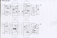
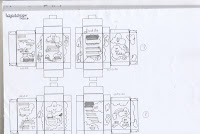
After learning the layout technique that Lorenzo showed us, i thought i could use the technique to work out some layouts for the box. It was really easy to do, just photocopy the box layout and then put the images and content onto the scans. Also it was useful that i had already worked out the information and content, because then i could just play around with the illustrations and type. In total i did 8 different layouts, with different amounts of detail on and these two images below show the best ones, or the ones with most room for development anyway.
In the end i decided to use the last two illustrations, this was because there was plenty of room for development. The images spaced well equally and there was a good balance. In contrast to the first image they are hectic and there's too much use of the space making it unclear. I prefer the layout where you can see the cloud characters more clearly, it gives some depth to the piece and the product takes on the shape of a character itself.
The next stage is to take these layouts and put them onto the illustrator and work them around to get the best fit. I found using these layouts really useful, it really helps you gage where the potential is.


Stuffs

Wednesday 19 May 2010

After working out what the content was about it was much easier to work out what the content would actually say. I decided to run on basic hints and tips i've learnt over this year like; don't be late, make sure you sign in, check your emails etc. I worked them out, but they were all coming out quite formal and i wanted them to appeal on a more friend level, as if they were being spoken to you as you read them. So Polly and I, went through each one and chopped and changed it, to sound more realistic and more like little words of wisdom, then a patronizing lecture. It is important to get the right tone of voice, it needs to match the designs, and as i had the designs it was quite easy to make the text match it.


Now that i had both the text sorted and the format of the box, it was time to start working out the design layout.

Where am i now

So after completely scrapping my other idea. I am now going to create a 'bumper pack' for the first years. this still stays within my boundaries of having a friend for that first week because it is still being designed around the idea of the box, and the box having friendly illustrations all over it. It will still be using the cloud illustrations, its just the content that has changed. I have also decided to put accessories within it, much like the Munny box that i looked at. Something for them to write on possibly and maybe something to carry around im not 100% sure yet. I want it to appear as if the box is your friend, giving you friendly advice etc.

I am much happier with this design because it gives me more avenues to go down at a later date, should i choose to.