'Getting people to tell the truth more' Evaluation...

Friday 26 March 2010

Sooo...The project is finished. The work is done. And what a brief. I really REALLY enjoyed working with Chris Starkie.


Personally i think we worked really well together. We didn't fight, we didn't argue we just got on with the project and appreciated each others separate skills for what they were. I did think at the beginning of the project we may clash but it really didn't happen. We managed to share the load of the project equally, with Chris working on the computer based part (The Web-design, the layout) and myself doing the craft based part (The Illustrations, putting the book together). And we both worked collaboratively to create content.
As both Chris and I are fairly organised people we kept to a schedule, which in turn kept our specific areas organised and it meant we actually had the project finished the day before the deadline. We weren't flapping around at the end of the project. Chris's level head also kept me from worrying and panicking that everything wouldn't be done, which was a nice change.

I think I really can speak for both of us and say that we were very happy with the outcome. All our hard work had really paid of. By creating the branding of 'Muzzy' it meant we could easily transfer the branding to the website, book and maybe later merchandise. By having the corporate identity it left us open to a lot of different areas, that we could possibly take further.

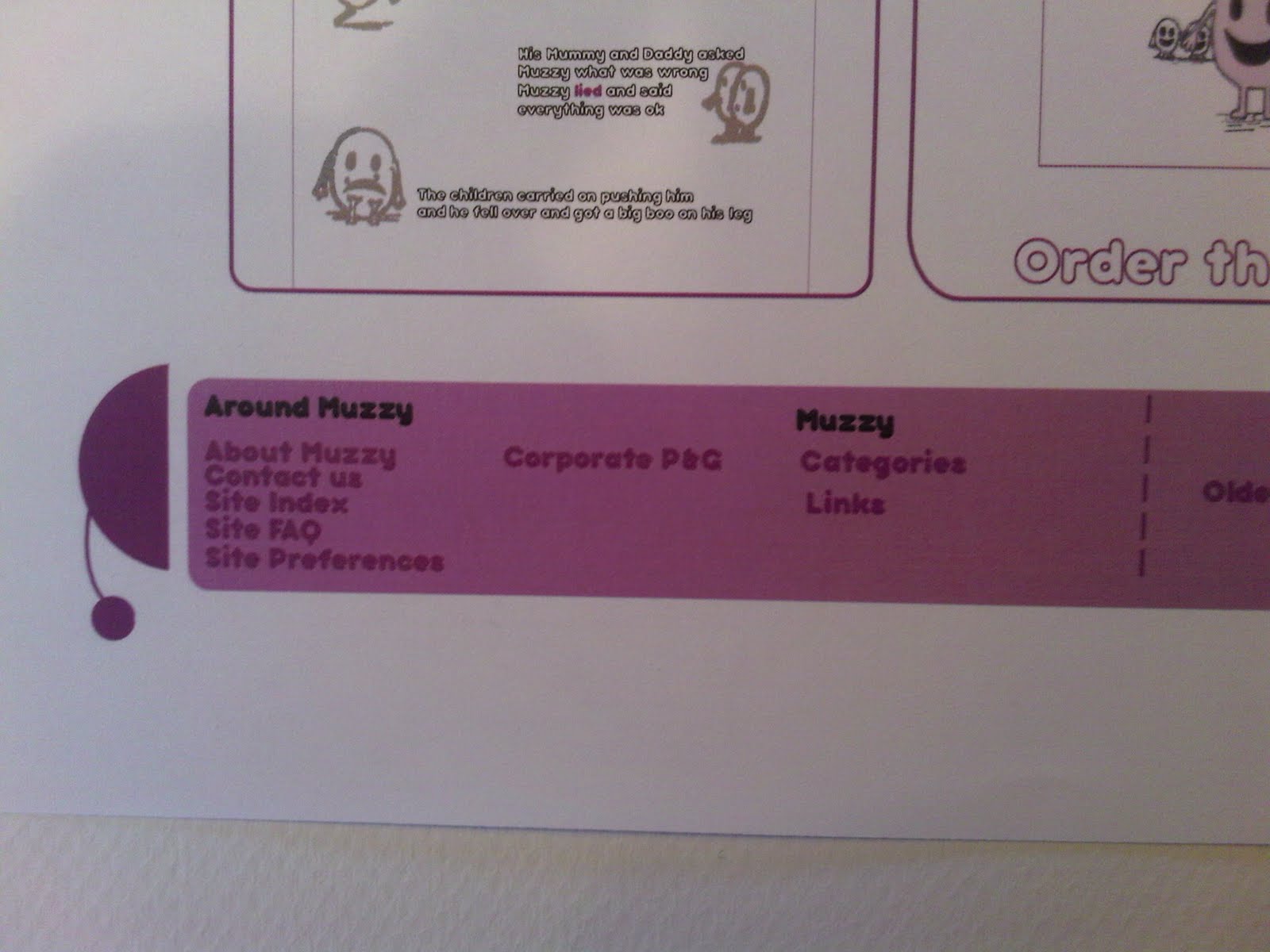
Now for the products themselves. The websites, i think, worked really well. The colours, text and images were in keeping with the whole design which meant there is a continuity between the product and the web-designs. This was very important for me, as I really wanted the whole project to flow and it look like a set. I really think the illustrations worked well, by creating an asexual character it meant that all children could relate to Muzzy, meaning there was no specific gender bias towards lying. Combined with the content that both Chris and I settled on, the stories really come alive and the illustrations help drive the message home to kids. I really like the concept of the book, creating a book that both children and parents can relate to. One in the fundamentals of lying and the other in learning ways to discipline a child without causing hurt or pain, thus creating a gentle and friendly bond between the parent and child which will help them both in later life.

Generally i was/am very happy with the way we worked, what we put together and how it was all done. I think we utalised the time given effectively and have left avenues open for use to pursue later.

Final Images of Muzzy Book


Responses to the product

On Friday we put our book and websites designs out and everyone went around and made comments on each other products. We received a variety of different comments but all constructive which was good, and telling us things we already knew which was good as well.


- 'the visual are spot on - very accessible and easy to follow'
- 'very nicely made book'
- 'great idea - Bot sure about the fold lines on the book' - dust cover we need to reprint
- 'a lot of effort has clearly gone into this, love the illustrations and idea'
- 'really well crafted book. i think it could have been brighter in terms of appealing to kids but the content is absolutely fine. nice work'
- 'well constructed book, colour could be more 'child friendly' but stories work really well, good content'
- 'think it targets audience well'
- 'the book is beautiful, but why have you put the dust cover on? it doesn't really fit and is not folded/scored well. everything else is very well delivered, good work!'
- 'love it, very nice story and drawings'
- 'really nice book - fun and easy to read - keeps pushing message and works well for kids'
- 'good design concept, could have used colour more effectively'
- 'illustrations and type and layout appropriate for audience'

Muzzy Webdesigns

Thursday 25 March 2010

Again as i mentioned before, Chris was in charge of all the computer based work, which meant he created the website designs.
We wanted to create a web base where parents could come along and upload their own stories so that other parents could then read them to their children. It would be like an online database of stories, and this would also mean that if we took the project further we could create more illustrated books for children.
We both agreed on the content, having it in keeping with the style of the book, with the same colour scheme and similar fonts etc. We wanted the book and the webpages to have continuity. Chris managed to get this exactly right. Below show the splash pages he created as well as the facebook and myspace pages.


Muzzy comes together

Wednesday 24 March 2010

So, the stage has come for putting the Muzzy book together. The layout, done. The illustrations, done. The content, done. As i mentioned before I had taken on the role of craft, because we worked out that i was more craft based then computer based unlike Chris. So we both went to Vernon street to put the book together. Chris came in order to make sure everything went smoothly and for moral support, and a helping hand! It took us the best part of the day, but eventually the book came together. I think i can safely say that both of us were chuffed with the final outcome. The book had the professional feel that we were both striving for. The pages fitted perfectly and each page opened the way we wanted it to. The cover was seamless and the dust cover fitted comfortably around the book. The only problem being, we printed the dust cover with the lines still on them, which illustrated where the folds were. This was annoying but we said we would just print another one off, as we realised once it was around the book we didn't actually need the lines anymore.


Layout

Tuesday 23 March 2010

Chris and I, during our project had decided to delegate certain things to our strengths. For example I did the illustrations, and craft side of things whereas Chris did the Layout and web-design side of things and we both did content. This meant we would both have things to do and everything was split equally.

So once I had done the illustrations, we had settles on a book and had the content ready it was down to Chris to organise the layout of the pages and putting any finishing touches to the content that he thought appropriate. Before we sent it to print we both checked though the pages just to double check that we were both happy, but Chris did a great job so i was very happy.

Below are examples of the layout that Chris designed, these aren't the final ones we used just rough copies that i managed to get hold of. I really like the way the text is offset with the illustrations, its kept simple and easy to read. The illustrations match the text, and both share an equal amount of space, nothing is over-faced, which works really
well.


Muzzy Mock Up 2

Monday 22 March 2010

As I previously mentioned, Chris and I needed to find a binding that was appropriate to our book. We needed the book to open easily and show all the pages, as well as stay open, and not have the next page flip over once your turned it.
So, when we went down to Vernon Street, we asked the tutors what would be the best way to achieve what we wanted within a Japanese bind. We looked through a range of different binds and books and settled on the binding below. This is a double bound book. Instead of having the back flat, you put in another fold. This enables the book to open from both sides. The book still remains sturdy and you can read the pages within easily. The book also stands up well, and it makes the pages easier to turn. In order to do this our binding string would have to be looser then normal in order the have room for flexibility.


^ Front Side

^ Back Side


Muzzy Mock Up

Here I have put together a mock up of what our book will hopefully look like. Its a very rough outline, but it will help us when it comes to the layout of the pages and lining up for printing.

We decided to wrap a dust cover around the book, this is to give it a professional edge and it also means kids cant take it off and put it back on again, it gives the book some other interaction apart from just turning the pages.

By creating a rough guide like this, it will also help gage the size that the dust cover needs to be in order to wrap around the book, we need it to fit comfortably, and room for it to bend etc. the only problem we are facing is getting the all the pages to be read easily we need to research into the binding of the book to see if there's an alternative way to open the pages so we don't lose a lot of the book.


Crit.

Today we had yet another crit, this time we got to speak to John about our ideas and where we were going without our project. It was quite interesting getting to talk to him, as he hadn't been around our ideas before and where we had come from. There wasn't much advice John could give us as we were pretty much all set, however as he had illustrated a set of childrens books before, that related to children going through a parental divorce, he could understand our idea and he said that if we got it right then it would be very influential in the future. That really gave us a good boost because John liked the illustrations and the stories and the ideas behind them.

All together a very good crit.


What is a line...

After choosing the type that i am interested in, the next stage was to try it out with an image. I have also tried out with the boxes and without. Personally i prefer the type surrounded by the boxes. all the colours correspond to the image and it doesn't detract from the image. What i also like is the boxes draw the eye immediately and bring the type out.
I think that in '2' the type is just too plain, and although its simple and you can read it, it looks a little half done, and rushed. Which isn't what i want. I want all the images to have a continuity for both front and back, and i think the type is really lacking without the boxes.

What is a line...

TESTING OUT TYPE AND PLACEMENT.

I have a more detailed analysis in my sketch for each image, so i will give a general evaluation across the pieces here. generally across all of them i prefer the type to be central. this is because its eye catching and looks like it fits, when the type is placed all over the page it's a little confusing and doesn't quite settle on the eye right. I want the type to be simple and clear, and i think it being placed in the middle achieves this.
When it comes to size, i defiantly think the smaller the better. My reasons for this are that with a type face being large it is really in your face and it doesn't mirror what i want. The image on the front is delicate and complicated and i want the type to mirror this as much as possible, but without detracting from the image itself. I am not trying to sell information after all i am trying to get people to pick up the image because it looks good.
Ultimately i have settled on using the smaller type central at the bottom. I haven't quite decided whether to try it with the boxes or not and that will need further development and investigation.


Illustrations..

Sunday 21 March 2010

The development for the illustrations for our book, they have been hand drawn, then put through illustrator and edited. we are still deciding on the best colours to use but for now we have the basic outline which gives us a lot to work with.


What is a line... SET 4

Saturday 20 March 2010

SET 4
-------

This set is of the Leeds train station. I really like the clean and sinuous lines. The colours work well on the plan background and you can pick out all the details easily. I especially like inside the train station. I wasn't going to do the interior of the buildings but i decided to give it a try and seeing as there is a lot of great architecture going on inside the building where better to try then the train station. I didn't pick out all the various poles and wires etc, purely because there was no need and i didn't want to over crowd the image.
I really like the last image with both combined. They both show completely different perspectives, but they are both linked. one runs from the outside then runs to the inside. These images give another perspective on a normal every day building, which makes a change for those commuting etc.