After i had tested the mountain faces, i wanted to attempt to animate the island itself. After settling on the island design i wanted to animate it like i had with the storyboards i had designed. This turned out to be quite easy to do, i want the perspective to change and give the island some depth. I used the perspective tool and the basic 3d tool to give it some perspective. This has worked really well and i really like how slowly it progress across the screen. Once i had animated the island i added an animated drawing to the composition through nesting comps. it hasn't really worked that well. the idea was to have the mountain standing vertical to the island, but it all seemed to merge into one. So for future reference i think that i am going to use the rotate tool instead of the basic 3D because it doesn't give me the depth i want when it comes to animating the mountain sequence. overall though i am happy with the concept and its another part of my sequence i am going to use, once tweaked.

For the next lot of tests, i have taken the animation of long john silver that i am using and transfered the skills/style from the tests i did with Jack Sparrow. It was easier to do it after i had first tried it out because i knew that i now only needed to use one stoke to animate the full sequence. The whole animation works a lot smoother and the speed is right because it isn't taking too long to animate. I also added the background that i have been using to see what it would look like with the animation on it. I really like it because i does look like ink being drawn onto the map. I altered the perspective in order to give the layer more depth and an interesting angle to view the drawing.
With this next sequence i added a new layer of light. Mike had showed me and Polly how to alter camera angles and he said that lighting may add another depth to it, so i thought i would experiment. I really like the color because it adds to the transition that is happening with the drawing. It emphasizes what is happening. This lighting technique is defiantly something i want to incorporate into my animation. Although i haven't quite worked out fully how to use it so i am going to have to experiment more.
With this video i added the audio that i have been experimenting with (Parlay - Pirates of the Caribbean) and also added text at the end. Now i don't think the text actually works that well. It seems too crisp. However, i do like the style so i think the best thing for my to do it hand drawn my own font, but using this font as a guideline. As for the audio, i wanted it to build to a crescendo so that when it moved across (which it would in time) then it wold give it a good sound bite for that transition.
All in all im happy with these tests, again they have shown me new things i can incorporate into my animation. The key im finding is to keep it as simple as possible. Add things that have a good effect and would match the style i am trying to create, but at the same time keep to the basics we have learn't because i know how to use them.
Above show my idea of how i wanted the faces to be drawn, i wanted them to appear in one fluid motion. I decided to test it out before i went onto after effects to see if i could achieve it and then later work out how to do it. I layered tracing paper over one another to get the effect i wanted.
This first test i chose a small part of the animation to work with first. Working in baby steps. The timing for the piece wasn't exactly right because i wanted the hair to be drawn first and then the dreadlock. But instead it worked the other way around. I wasn't sure how to change this so i just left it. I do like the detail that you can achieve though and the speed with which it has drawn itself because you can see each detail for what it is.
This second video was about looking at spreading the stroke further and working on getting the outline of the shape first. Then adding the detail within it. However what i was beginning to work out was that i needed to mask the parts that i wanted to animate last, first instead of the other way around.
This is the last test i did which involved adding the detail of the face. I did/do really like this, theres a good amount of detail it doesn't happen too fast so you get to see the level of intricacy as it moves showing the face.
This is defiantly going to be the style i use in order to reveal the mountains and the faces within. It achieves exactly what i want it to, which is the hand drawn effect. this ties nicely in with the map that i am doing because the maps i have researched are all hand drawn so it stays within the style. I am really happy with this so i am now going to try it out with the vectors i have designed for the map.


Today i have altered my idea slightly. Its still the same motion graphics idea but now its more specific, this is due to the crit I had. I have decided to properly define the show and the pirates within it, so i have gone for Top 10 Famous Fiction Pirates - so this basically means the most popular fictional pirates that people know.
The pirates i have chosen are:
CAPTAIN JACK SPARROW
CAPTAIN BARBOSSA
BOOTSTRAP BILL
BLACKBEARD
LONG JOHN SILVER
ONE EYED WILLIE
CAPTAIN HOOK
BILLY BONES
DAVY JONES
KANHGI'S ANGRIA
All of these pirates are fairly well know and if people spoke of them you would know who they are. My next stage is to add illustrations for them. Now i have already decided i am not going to show all the pirates in the title sequence but i do want a selection to show and have a choice to illustrate. I have already drawn Jack Sparrow and Blackbeard but i want to draw Long John Silver and Boostrap Bill.

I have done some test pieces for the faces that i want to use within my animation. I went to speak to Mike Flower because i was really struggling with how i would get the face to come up on the design and make it look like its being drawn or coming up gradually. Mike confirmed what i though which was i am going to have to cut the images into desperate pieces and then animate them individually. So thats what i have done. I took part of captain jack sparrows face and then edited so that i could animate the pieces separately. The quality of the videos isn't great because i set the screen wrong, it was continuously rasterizing but for some reason its still pixelated. But seeing as these are only test im not too bothered.
Jack Sparrow from Robyn Russell on Vimeo.
This first video shows the idea. The face turns up gradually. I really like the fact the face comes up followed by the details of the body. This is very rough but it it gives the general idea. I like the style of it and i think with more attention to the detail it could work quite well. To get this affect i changed the opacity and the timing with which it happened.
Jack Sparrow 2 from Robyn Russell on Vimeo.
For this next video i decided to add audio to it, i think it works quite well. I overlapped two pieces of audio. Some from the trailers and then a backing track. I think the image appearing slowly and letting you see it before the voice over happens really makes adds to the animation.
Jack Sparrow 3 from Robyn Russell on Vimeo.
I added type to this last video, but its pretty poor. I really don't like it at all and i think if i am going to add type then it needs to look a lot more smooth. And have the type linking to the voice over better.
All in all the trials were good they have shown me what i need to do to achieve the affect i want. Its a good experience trying this out before i add it to my actual title sequence.


Today i did some test on different island splatters that i could use for my project. I was struggling to get the outline that i wanted to have from the splatter. I drew these and then designed an island drew a small island with details that i think i am going to use. I think all of them work below but i prefer the ones where when it hits the map it explodes with an outline not a block of colour.


Island 1 from Robyn Russell on Vimeo.
Island 2 from Robyn Russell on Vimeo.
Island 3 from Robyn Russell on Vimeo.
Island 3 from Robyn Russell on Vimeo.
Island 5 from Robyn Russell on Vimeo.
Island 6 from Robyn Russell on Vimeo.
I know that i am going to be using a map within my animation so i needed to get some illustrations that i can either animate or have within the map. Another thing was that i was struggling to get the right shaped splatter for when the cannon ball hits the map so i have designed my own. This means i have more control with how its being animated and how i want it to look. I have also added deatils so i can see how they would look.


My idea is to put the pirate faces into an 'mountain' face. So they can all be animated at once, below are the assets i have put together. The problem i found once i put them together was that they were too squashed and that you would loose a lot of detail, and it may be boring to watch a 50 second animation with just 3 faces in it. So i think in the future i am going to separate the faces so that they can be animated individually, it gives me a lot more scope to do what i want.


I put the images into illustrator to see how effective they would be, but as you see you do loose some detail and i think that it would be a little too boring. However i may be able to use these images later for my idents.


I have been looking for a range of appropriate songs or snippets of songs to use within my animation and title sequence. Its important for it to have that 'piraty' feel, and it want it to try and compliment the animations.
I have looked into one song from the pirates of the caribbean film called fog bound, by klaus badelt. This song is broken up into a lot of different styles with different types of music played throughout. So i though this would be great, as i could cut different aprts from the same song and then use it either for my full animation or for my idents
Fog Bound full from Robyn Russell on Vimeo.
This above is the full song.
Audio cut 1 from Robyn Russell on Vimeo.
I like this small chunk because it gives an eerie feel to the animation. I have some ideas about creating a ship coming from mist or arriving on the horizon and i think it could go well with this. This is possibly something to use for an ident.
AUDIO1 from Robyn Russell on Vimeo.
Again this is another piece of eerie music that i could use.
AUDIO2 from Robyn Russell on Vimeo.
This next piece of audio is cut from the beginning, its quite jovial and lighthearted. Its also fast paced so i could use it within a faster ident. I like the contrast between the first two and this one.
AUDIO4 from Robyn Russell on Vimeo.
Again i have chosen another contrasting piece, its similar to the previous audio but differes because its a little more 'serious'.. I think this would be good for a different styled ident.
generally i think all this audio will be used for my idents but i have collected a nice range to help when i crete my animations. I can now bare in mind the style of audio i will be using.
I have been looking through a range of appropriate audio for my animation. I want to try and look at songs that realte to piracy or that have some sort of pirate lyric within the piece. I want it to be recognised so that it compliments the animation. I am not sure that i want to use voice audio over the top because i dont think its going to be appropriate with the aniamtions im planning on creating.
One song i have looked at is The Trooper by Iron Maiden. I am only interested in the first 50 seconds, this song has reference to pirates in it. Its up beat and fast paced song could really work with a fast animation. I am going to keep this in my when creating my animation.
Iron from Robyn Russell on Vimeo.
Another Song choice is Captain Dread. This is a jolly song that has the essence of piracy and old irish folk song in it. It also has people speaking over it using pirate terminology. The only problem i have with this song is it's very repetative and would get very annoying to listen to after 30 seconds or so. So im not sure i will be using it.
Captain dread from Robyn Russell on Vimeo.
I have chosen to have an explosion sound effect because i already know i am going to be using cannons in this sequence and it is only appropriate to have the sound effect. The sound effect i have chosen is loud to begin and fades out adding to the effect, sound realistic.
Today i went through some for the pirates of the caribbean trailers i researched and i have cut down the audio that i could possibly use in my title sequence. I have put it all together in the post below. There a variety of things i have used, i have a few examples of 'im captain jack sparrow' and some other cuts that i could just put in.
video 1 from Robyn Russell on Vimeo.
I really like the 'Yo ho Yo ho...' I think it would be good to put at the beginning of the title sequence. Im not quite sure how i would work all the audio in but its just an experimentation i have put together.
after i put this together i decided to try out some kinetic typography. I havent really done much with animating sentences within after effects so i thought now would be a good time to experiment and remind myself how to do things.
Video 2 from Robyn Russell on Vimeo.
What i like about this video is how the type is timed with the audio. I know there is an easier way of doing this, but i cant quite remember so i had to key frame everything exactly. I like how all the motion ties in and how the zoom out at the end really works with the growing crescendo.
Video 3 from Robyn Russell on Vimeo.
with this video i really like the movement with the type especially when the 'name' rotates down as if it drops. I want the opacity to change on the jack sparrow at the end but apart from that i am happy with it. It was quite hard working out the camera angles because it changed the spacing and orientation of the words.
Video 4 from Robyn Russell on Vimeo.
This one was focused on using the type animator effects. It had been a while since i had used them so i needed a refresher. I like how the font is shown up slowly. I really like the style, although i think i would take out the fact you could see the word before the type moved across it.
Video 5 from Robyn Russell on Vimeo.
Cannon from Robyn Russell on Vimeo.
I decided to take part of the storyboard i had created for my title sequence and animate a small part of it. My idea is to have a cannon shooting out of the screen and then forming an island. I had a bit of a problem working out the timing for this sequence because i wanted the cannon to be faster as it came at the screen but i couldn't quite seem to get the timing right. I think the animation works though, i really like how it completely moves off the screen and then something different happens. The next stage was to add appropriate sound, just to give it something else.
Cannon from Robyn Russell on Vimeo.
Again this is the same sequence, except this time i have added an explosion noise to it. It gives the animation more of a realistic feel and i timed it just right so that when the cannon stopped moving the ball would be fired out accompanied by the noise. I also manipulated the sound to last longer so that as the screen was washed out it would still have some echo to it. What i'm not so sure about is the sudden stop of the sound.
Cannon 3 from Robyn Russell on Vimeo.
With this sequence i cut some music from the Pirates of the Caribbean score and added it to the animation. what i think is appropriate about this music is the fact it builds up to a crescendo. Obviously it cuts out before you reach it because i have only animated 10 seconds, but through the rest of the sequence it would be good. Its timing was important so that the crescendo was just building when the zoom in on the island happened.
Generally i am really happy with these animations, i think the concept works and it ties into my original idea. the next step is to start working on animating within the island. This beginning sequence is not set in stone and i have some tweaking to do to it but it has given me something to work from.
Today we had a really useful workshop with after effects, we finally got to add sound! This was something i was really looking forward to because i do want to use sound within my work but i didn't want to experiment with it until i was ready and fully understood the process. Earlier on in the morning before the crit i had started to put together a short animation taking an idea i had from one of my storyboards.
This was the first animation i put together in the morning. Its very basic and doesn't use motion blur or the key animation ease in and out to help with the natural flow of things. So at best its rustic but it was the beginning process.
With this video I added the motion blur and other techniques in order to give it a natural look. I realise that the path of the cannon ball is not exactly what the ball would do in real life, however that was not the point of this experimentation.
With this next video it was my chance to add audio to the piece. Mike had put some basic sounds together and there was a list of explosive sounds that i could have used, i found this sound to be the most effective because it gave the piece a more realistic feel too it and sounded the most cannon like. The sound times perfectly with the cannon ball moving out the cannon, and personally i think it works well.
With this next sequence i found an audio clip on youtube that was from pirates of the caribbean. I managed to download it and adjust it to fit within the sequence. This gave me a chance to use my newly acquired skills and cut the music so that i could use the bit i liked. I realise that it isn't perfect and doesn't really fit because the music builds up and apart from the cannon firing that is all that is happening, but it has helped me anyway.
Audio 4 from Robyn Russell on Vimeo.
With this last I re-cut the music and added another cannon so that it would feel like there was more going on. I feel the exploding cannon actually fits quite well within the sequence and the music. By turning the background music down the explosion becomes more prominent and captures your attention.
I am really happy with these videos, its helped me work out how i would process my files in order to have working audio.
We were given the task to find a standard serif font and break it down into its seperate components using the Catherine Dixon method of categorizing type. I picked the font Georgia. Its a very commonly used font and i thought that if i could begin to understand this font then it would help me in the future. I found the task quite hard at first, trying to get the terminology right and recognizing certain relevant parts. However once i got into it, i found deciphering each part of the letter form to become easier and so therefore finding and understanding the relevant information became easier. By doing this excercise not only did it help my understanding of type but it gave me another opportunity to work with a structure layout, which was great because i haven't worked with layout like this in a while. Below i have posted my final breakdown of the anatomy of Georgia:

I have .PDFed my presentation boards for tomorrow. They are broken down into the categories i deemed necessary to clearly show my idea. They convey my audience, the tone and the content. As the content is very important to my idea, with regards to the illustrations and style i am going to produce, i focused on getting this point across. I have covered all the basic concepts i have come up with thus far and some experimentation i have developed. My concept is clearly stated below in order to give myself a basis to work from:
Top 10 Pirates of all time.
Shown through illustration and the use of kinetic typography.
The tone will be humorous.
The age range is for 15+ as that is what the show would be aimed at.
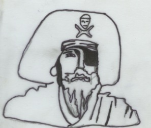
I have put together a couple of sketches of the pirate faces i am thinking of using. I still think they need work, i don't think they are as detailed as i would like and the lines are a little too thick. however doing it has made me rethink the possibility of merging the faces, i think i am going to have to draw that whole so that it looks more genuine then me just putting some images together. I am happy with the face choices though, i think they look 'piraty' and when they are put into the sequence they will work. As i have done more illustrations i need t get the faces to link with the other styles i have done so that it all flows.

Today i sat and created some sketches for my animation. I know i will be incorporating pirate related items in my animations such as rigging, cannons, ships etc. So i wanted to get some simple designs together so that i could start animating short sequences in order to give myself a general idea on how i am going to do things. I have only done the cannons and ships thus far, but i have started on the pirate faces and the rigging. I am really happy with the sketches, they are clear and you know what they are. I have used a slightly different drawing style with the cannon compared to the ships, this is because i wanted the cannons to be quite detailed whereas the ships didn't need to be as they would be viewed from a distance, or used as a backdrop.


Just to help me gain some inspiration from the research i have done, i have put together a few storyboards. They are at their best, basic. It has however helped me gain some idea of what i will be doing and where i need to be focusing my research with regards to after effects. My basic idea is to get the title sequences set out and animated and then using imagery from the title sequence i will then generate the Idents. I think my title sequences are going to be quite complicated, and therefore i will have a scope of designs to take from and design with. I am really excited about starting animating.
Here i have put the designs sheets i have created so far into a .PDF binder. It shows my ideas around the pirate option i have chosen and where i plan to develop the designs and animation. Its all very basic because at the moment its rough ideas until i start doing my animations. I am going to start practicing certain aspects to see whether they will work with what i want to achieve but as for now, the basics for my concept are shown above.


I have decided to put a list together of things that i find interesting and would like to do for the 'Top 10' project. My ideas are listed below:
Westerns - As in cowboys, the music, the fonts etc

Pirates - (I have an unhealthy obsession for all things pirate!) - Famous pirates, stories, characters, books, films, music etc.

Ugliest Creatures - For example in the deep deep sea, and other animals that people don't know about.

Beautiful Flowers - Most exotic and beautiful flowers in the world.

Dire straits songs - I am a huge fan of dire straits, so picking some of my favorite songs of theirs to animate would be good. A lot of them tell stories so that would be interesting.

Dylan Thomas - Poet and quite a strange man, but it would be interesting to animate and produce some work that relates to the story's he tells.

Gormenghast, By Mervyn Peake - Series of books, the storys are fantasy but not in the usual sence. The man who wrote them was slightly insane, and the books depict that. Characters, stories, tv series.

Japanese Stories - The old stories. Writing, type, stories, characters, culture.

American Food - Reeses cupcakes, nerds, etc. Just the extent america go to for luxury food, can look at type, info, promotion etc.

Murder Stories - Serial killers, mass murders, famous killers etc
here are my PDFs for my silent movie brief. taken from the 4 videos i am really happy with:
Click background from Robyn Russell on Vimeo.
As before I have used the same animation for the Click that i liked and created a very simple background for it. It's nothing special by any means but it was more for me to know that i could create a layer in illustrator and import it over for the background (Show below). Once I had added the same sequence to the background I had to change the opacity of the layer because you couldn't see the type all that clearly, and if i'm honest you still cant see it as clearly as you could. But as i said before this was more of an experimentation to see how easily it could be done. I have also realised that splitting the background into different layers so they could be animated separately would actually be very visually interesting, so this is something I am defiantly going to be investigating further after Christmas and when we get back to start the title sequence brief.


