Final Product Images.

Friday 12 February 2010


End of module self evaluation


BA (Hons.) GRAPHIC DESIGN

LEVEL

04

Module Code

OUGD101


Module Title

DESIGN PRINCIPLES


END OF MODULE SELF-EVALUATION


NAME

Robyn Russell


BLOG. ADDRESS

http://r-russell0912.blogspot.com/


1. What practical skills have you developed through this module and how effectively do you think you have applied them?


For this module i was trying specifically to push myself with working with animation, whether it be across final cut/ quicktime player etc. I had never done anything like this before and i really wanted to try with it. Although my outcomes were not great, I had done my best and i now know the basics to push myself further with it. I was also pushing myself in making final packaging, I have never been great when it comes to this sort of stuff but i really pushed myself with this brief, and therefore pushed my skills with it. I think the outcome worked out a lot better than i had expected, i think it represents the idea of a boxset quite well, and incorporates everything i wanted it to.


2. What approaches to/methods of problem solving have you developed and how have they informed your design development process?


I have focused a lot more heavily on this project with generating my ideas from my research and trying to tie everything into my project eg. all about Batman, even colours taken from the Batman comics. I found this a struggle at first but by the end of the project it was really helping me generate ideas and push my development further. Also with this project i was really learning by trial and error, which I had done before but not the extent i had done with this project. It made me realise how vital making mistakes were in order to create a strong final resolution or idea for a resolution.


3. What strengths can you identify in your work and how have/will you capitalise on these?


I think my strengths with this project really lie within the research and development of ideas, whether it be researching things to create ideas or researching specific ideas and developing them to create a resolution. I tried really hard to constantly test what i was doing, and although the resolution isn't as strong as i had hoped, I know that i did enough idea generation and development to analyze specifically where it went wrong and why. In the future i will defiantly be taking these skills on, even if it is on a smaller scale i have found them to be very valuable to a project, especially in understanding its weaknesses.


4. What weaknesses can you identify in your work and how will you address these more fully?


My weaknesses in this project were was my resolution, i spent too much time collecting the content for my project and not focusing on the final outcome. The animations were not great, but it was my first time n using that specific software so in the future i am defiantly going to try and push myself further to really utilize its capabilities. I need to work on my delegation of time to my project so that everything had an equal share, I didn't leave anything to the last minute but i did priorities some things that i shouldn't have over others and that is where i need to improve.


5. Identify five things that you will do differently next time and what do you expect to gain from doing these?


1. Working out priorities effectivly


2. Delegate evenly throughout the whole project


3. Set myself mini deadlines within the project to help keep on schedule


4. Keep on top of my blog at all times, it is important that i don't lag behind with it.


5. Really push myself with experimenting again, although my resolution isn't great for this project i have accomplished and learnt so much, which for me is a big part of learning to be a graphic designer, and why i wanted to study this course.


Are there any things we could have done differently that would have benefitted your progress?


No.


6.How would you grade yourself on the following areas:

(please indicate using an ‘x’)


5= excellent, 4 = very good, 3 = good, 2 = average, 1 = poor


1

2

3

4

5

Attendance


X


Punctuality


X

Motivation


X


Commitment


X


Quantity of work produced


X

Quality of work produced


X


Contribution to the group


X


The evaluation of your work is an important part of the assessment criteria and represents a percentage of the overall grade. It is essential that you give yourself enough time to complete your written evaluation fully and with appropriate depth and level of self-reflection. If you have any questions relating to the self-evaluation process speak to a member of staff as soon as possible.


Final crit... following development


we had our final crits on Monday, and i presented my mock up final piece and my animations. It went okay, i got the feedback that i had expect, the animations were the weakest part of my project but my packaging idea was good it just needed to be made better and/or have a more professional feel. There were strong bits coming through but some things needed to eb changed for the whole thing to work.
So i decided after having a talk with Fred, to redo my packaging. Not totally i would still use the images and the text idea but i wanted it to have a more realistic feel to it. So i decided on creating a box set, instead of just a fold out. I had DVD daces and all i needed to do was create information backs for them and a box. As i had used black heavily on the original packaging i thought it would be good to have an all black cover, and then print a sticker that was shiny so that it would reflect on the surface, and all that sticker would be. Yep you guessed it, a Batman silhouette. I started developing ideas for the back, i had seen some previous box sets with images on the cover of what was going on inside and i thought that would be a really good idea, so i picked some images and started playing around with the text, images and layout.
I wanted the layout to be the same across all the DVDs and the boxset itself, it thought it was very important to have a continuity to it, and i would get it with this. I need a design that was transferable. And by experimenting i settled on one, i did like the idea with the images along the side but when i tried to transfer it onto the other dvd boxes, it just left a lot of dead space which i thought looked rubbish.
The next stage was to put the whole product together, and get ready to submit it.

DVD Development


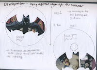
The next part for packing was to create some illustrations that would go onto the DVD cover, i knew what i wanted to do before i started this and that was to transfer the idea i had had previously which was using a bit of the comic strip and having it within the batman silhouette. I think this would look really good, if printed on a solitary object and not as an animation. My only problem was working out whether to have it large and printed across the whole surface or just printed on its own.

I cut out a variety of different comic book strips to see which one would look the best and capture batman in the best light, i wanted it to be all about him so i didn't want anything with a lot of interaction with other characters or speech on it. Eventually i found one that i was looking for and then it was a case of working out the best placement, and working out where the information would be put on the disk. As you can see i tried out a variety of different ways but i decided the generic 'underneath the image' would work best, purely because of the fact that it would mean the discs would look more professional which at the end of the day i really wanted seeing as the content on the discs wasn't that great. I wanted something to look good.

Development


The next part in my project was to create the packaging, i had stared with ideas and decided to take on the last idea using illustrations from old comic books o generate the covers. I traced the designs i liked, all just being about batman and transfered them into illustrator. I wanted the cover to be completely black so that the figures would just stand out. Above shows putting together the final pieces, using type and image or just image. I liked the idea of using batman sayings instead of just having 'this is disc one and it contains blah blah blah' i wanted a different way of communicating it to the batman fans. So i decided that some quotes would be good, and people could relate to them. It meant it was in keeping with the batman theme too. Obviously there would have to be information on the box to tell the recipient what it is, but i wanted it to be as limited as possible. I really like these designs, i think that the images work well and its simple enough to convey batman.

Initial ideas for front cover..

Tuesday 9 February 2010


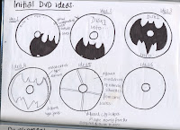
Again with this section i will be evaluating the ideas that i have come up with.

Idea one - Series of batman silhouettes projected across the cover of the DVD. I like the silhouette images and i like the fact the images are printed across the dvd case, having said that it is quite a boring dvd case. I like to develop my idea further somehow incorporating the idea of the silhouette and projection..

Idea two - Projection across gotham city. I like the silhouette actually projected across the city giving it some form of interaction. I also like the detail within the projection cannon, giving the image more depth and something to look at. Having said that it isn't the most interesting of ideas and as i said before i wanted to include some old batman imagery, and this doesn't really include any.

Idea three - Way too complicated, there is too much going on and will distract the recipient too much. I wanted my idea to be simple and not be completely covered in irrelevant imagery. Having said that i do really like the imagery being spread across the DVD case, i think it works quite effectively.

Idea four - I like the idea of batman punching someone across the whole cover, having said that it doesnt really tie in with m project, there is no batman sign and there is no room for information. but i do want to include the imagery of batman and will develope this further looking at old comic books and their drawings.

Idea five - Boring. Although it does tie into the theme effectively, it is so dull to the eye, i might use this for the inside where the DVDs will be placed, im not too sure yet. I need to experiment further in order to see.

Idea six - Too much is going on and there needs to me room for information, it also doesn't tie into the theme.

Idea seven - Like this idea and i like the original traces that i used. I like incorporating the designs i took from the comic books, because it ties in with the theme and looks good. The only problem there is no room for information.


From this i am going to take on idea 7 and develop it further, i really like the idea. its simple and effective, i just need to make sure my illustrations are of a high quality because otherwise it will look shoddy. I need to pick images that will only involve Batman i don't think there is much point in bringing in his enemies or other people it will just over complicate the imagery which will ultimately detract from the overall visual appeal.

Packaging ideas...

Monday 8 February 2010

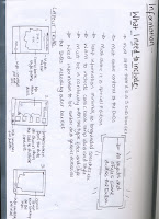
This section depicts my idea generation, again i set myself a list of what i want, a specification. With this section i will look at each idea and evaluate accordingly.
Idea one - I like the fold capabilities and the fact it holds the 3 DVDs snugly. although i do think that the design is bulky and unattractive. I also like that it incorporates the bat shape but it looks a little too complicated and doesn't really go with my 'simple' theme.

Idea two - I think that this is a good idea if it could be done effectively. and i am not sure that i could give it justice not with the time restraints I have and my lack of ability to manufacture something like that. I think that it is a little too ambitious for me and I want to create something that is simple, sophisticated and even if it ends up being a mock up i want it to be presentable which i couldn't see this ending up as.

Idea three - I really like these ideas but i am not sure it would work. I think they would look ugly. I like the idea of a utility belt but maybe using something smaller and less bulky, for example using those smaller DVDs the problem is i dont think you can copy to images onto the cover and i dont know if you could put the smaller dvds in the mac in order to copy the animations across which would inevitably defeat the point in having them. Having said all that i would, in the future, explore this idea further to see if it was at all possible, this would be a good idea for a collectors edition dvd set.


Pick your colour Batman...


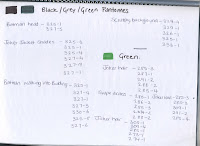
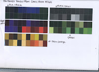
The next stage for the project was to use a previous idea i had and that was to look at the colours for the packaging. I was going to use the pantone idea i had had earlier, taking the comics books I had and stripping them down to their most common colours. I picked the comic book that had the most variety in colours and chose to make my palette from there. I needed a good mix between bright and dull colours and as there is always a lot of black within Batman comics, i thought it would be good to get a variety of different hues for the black.
I managed to get 100 different colours from the comic book, and once i had i established a colour guide that later would help me create my packaging using the most suitable colours.


Batman prepare to be packaged.


The next part of my project was to package the products that i had created. I gave myself a list of what i wanted to include, as i had spent a lot f time getting the information and content together to be put on the DVDS i had to work quickly and effectively with this part of the project. I needed to research specific areas and stay on target at all times, not get lost or digress. Which i think i have done quite well. As i had created 3 DVDs i needed something that would house them and look good. Because the animations were simple i wanted the packaging to be fairly simple too, i didn't want to bombard it with information and images. Just simple text and image, where needed. I began my research by looking at packaging that was on the internet as well as DVD boxes that i had in my flat, i am quite a DVD collector so I had a few to work with. Generally i found that the most extravagant box sets, were limited addition box sets which i would have loved to have done but i didn't have the time so i needed to focus my energies down into creating something similar but not as full. Through my research i found two box sets i liked, both came within a housing and one folded out and the other opened like a book, i wanted to work with these further.


Bat to the MAN

Sunday 7 February 2010


The next stage was to create my third idea, i already had what i needed to create the first two DVDs: 100 images for the transition, with the comic book background this time and 100 images of the batman signal all over the buildings inside and out. I needed to create the content for the 3rd disc.

This meant trawling around college and bugging every possible student there was to out on my batman T-shirt! It sounded pretty easy when i started, but i began to realize that there quite a few unhelpful students in college who thought that it was 'demeaning' or 'below' them to put the t-shirt on, this caused a few problems. And what didn't help was the fact that it was a girls t-shirt in 'small' which some of the boys were not happy about putting on, i could understand that but it did fit everyone! it wasn't getting it on that was the problem it was taking it off that caused a few..difficulties. What i did find very intriguing though was that out of the 100 people i took pictures of, both male and female, it was the men that wanted to check the pictures more than the females!
Anyway after a struggle i managed to get my 100 images together, and begin using final cut.. this was where the big challenge was.

I wouldn't say 'dreading' was the right word to use when i thought about final cut.. but there was defiantly apprehension. Whenever i opened it, it looked so intimidating, and especially to someone who has never used that sort of software, sure i had played around on iMovie but this was a whole different ball game! I am not going to lie and say that i picked it up really easily, i didn't. It was a whole struggle throughout, but i am stubborn and persistent and i was going to let it get the better of me. Nothing seemed to work and it was very frustrating. It hasn't put me off using the software if anything it has made me want to use it more, because i know there is so much potential within it i just need to learn to tap into it!
Now that i had created my content to the best of my ability it was time to focus on the packaging and what i wanted to create, this bit i was particularly looking forward to.