We had to take the position statement we had created about ourselves and shorten it down into some main bullet points. Below are my list:
1. Diverse Designer
2. Being part of a working team
3. Want to be pushed by other designers and vice versa
4. Customer/Client/ brief care is important to me
5. Creating a functioning relationship between both designer and client is also important to me
6. I want my work to represent me in some way
7. Want to engage with people that are as interested in design as i am.
8. Want work to be original
9. Want to have some strong type based work
10. Love print based work - packaging etc
11. Interested in branding
12. Type drive and layout driven
13. An organised and methodical designer
14. Want to gain as much experience in different areas as possible


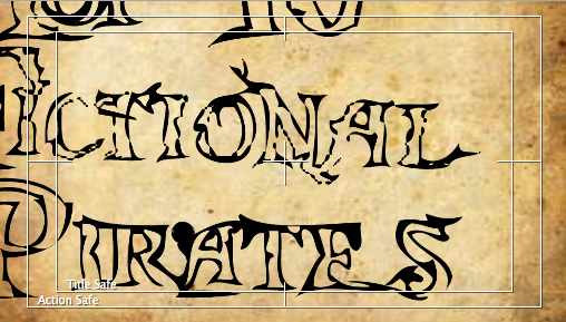
Final Title Sequence
I am really happy with how my title sequence has come together. I started it bit by bit so that it wouldn't get too complicated too fast because there were a lot of separate animations running at the same time and it would have been easy to get confused and therefore the animation wouldn't work. By separating it into chucks i could work on separate areas and if something needed tweaking it was easy to go back and find what the problem was. One of the biggest problems i had with this whole sequence was working with the map background in 3D. My concept was to have a huge map and then using the camera tool move around it to different areas so different animations could happen. However, this proved to be problematic as the map was scaling too large and i was loosing a lot of detail. So this did take up some time fixing. However, once i had overcome this problem, the rest of composition seemed to just slot into place like a jigsaw puzzle. Because i had run every separate animation using different compositions bringing them in with the nested composition was a god send. Again this meant that i could work on individual parts of the animation without worrying that it would damage the rest.
As for the fluidity of the piece, having it run smoothly was very important. As it was continually moving, i had to make sure there was movement happening at all times with different paces so that it would correspond with what was going on. generally i think i have succeeded here. There is not one part of the animation that completely stops, and there is enough time spend on the important elements so the viewer has time to read and compute what is going on. The time management within the whole composition was very important, i had to break down the specific areas that needed to most time and then work around with the rest of the sequence. Once i had worked out an appropriate time line, this was very easy.
I am very happy with the style of the piece, i feel it really communicates the idea of a hand drawn map, which is very symbolic of pirates. This was the main focus of my piece.
I have really enjoyed putting my title sequence together, its been a really good experience and taught me more than anything th organisation at is the key to having a successful animation.
Here are my final idents...
It was important for me to have a level of consistency across my idents, as i knew i was using different assets to my title sequence. But as long as they were in the same style and illustrating pirat(y) things then they would be consistent.
Ident 1.
Above is the first final ident. I am happy with its function, it does what it needs to do, which is inform and entertain. While keeping the viewers engaged. This animation is simple, and it doesn't have a lot of elements to it making it easy to follow. The concept of a message in a bottle is good, because it relates directly to pirates and the tales of old about the. I am happy with the colour too, although it is different from the other animations i have done, i feel this did actually need it. Overall, i am really happy with the animation, it does what I set out for it to do.
Ident 2
This is the second Ident animation that i created. The concept being around the interaction with the type and the cannon ball. I kept the same ship to link with the other idents and title sequence, keeping a level of consistency. I had trouble with this ident because it was hard getting the ball to move in a natural way and interact with the type effectively. However, after working out my problems this ident actually works quite well, i believe. Again the concept itself is quite simple, but it has a visually pleasing effect. I like the interacting with the type and the cannon ball and i think it adds something else to the title without it just being a plain reveal of the title. Its something different to the other Idents i have done.
Ident 3.
This is my third ident, and its focused on playing with the perspective of the ship. I really like the concept behind this ship ident, it moves smoothly into the foreground. It was hard trying to get the effect of fog across the ship and it parting, but having played around with it a lot i finally got the effect i wanted. This was one of the harder idents to animate, because there were a lot of separate elements i needed to animate in order for it to look smooth. All in all thought i am very happy with the outcome of this ident. I think the audio compliments the erie feel i am trying to create with the visuals too.
Ident 4
Lastly, my fourth ident. This is my personal favorite. I think its because its so simple, that it really works. With this ident i just took elements i had already animatd and pulled together the best concepts, in my opinion. One thing i am really happy with is the font at the end. I hadn't used many other colours throughout this project, so it was a good chance to practice reversing out. As i said, this is one of my favorite idents and i am really happy with how it turned out.
I think throughout these idents/title sequence and project, there are a lot more things that i maybe could do in the future. I found that as i worked through ideas, it was hard judging what i could do and what i couldn't for the lack of knowledge and experience in the software. So i found towards the end of the project i was coming up with a lot more complex ideas that i could do in the future, and thats because now i can actually think and work out how i would go about doing things. It's a bit of shame that this project has ended so early because i feel i was just becoming good and efficient at working within After Effects.
As we weren't able to print on the discs in the mac suite, we were able to print on stickers and then place them on the DVD. Its only meant to be a mock up because the discs can't actually be put into the DVD players on the macs. What i did do before i put the sticker on the disc was test the DVD. I put my first folder of my final animations on the disc and then tested them on 3 computers in the studio, my laptop (which was a little judery but thats because its slow).


So, once i had put the sticker on i then placed the disc with the rest of my packaging. The images are below.


Final Ident 1 from Robyn Russell on Vimeo.
After my crit on Wednesday, people thought it may be a better idea to add a blue hint to the animation, just giving it a clearer feel of it being water. At first i was a little skeptical about this idea, but after i added the colour i can see now that it does actually work. It adds to the style of the piece without detracting from the main animated points. It adds to the feel of the animation and looks a lot more visually pleasing.
After choosing the DVD cover and selecting the type that i am going to put on my DVD, the final image is below.

DVD Covers...
Because in a previous module last year i had learnt how to print on DVDs..I say learn't i went to the bubble and they printed on the disc for me. However i am going to use the same technique to print on the DVD discs, the discs have to have our name and module code on them. So using the font that i have already created for this project i intend to put the information in the same style and then have it printed on the disc.


Fred pointed out that it would be good to reference how we have kept on top of our after effects and how organising has helped. With this project has been huge and there have been sooooooooooo many files, in a variety of different formats so keeping on top of them has been THE most important thing. So the best idea for me was to keep them all organised within one file.


I have altered certain aspects within this ident that i wasn't very happy with. I decided to change the cannon asset to a ship, it made more sense to the viwer to see a ship instead of cannon. I know that the title would later explain what it was about but i think it needed to be more obvious from the beginning. By adding this ship it also corresponds with the ship used in the title sequence, linking them nicely together.


With this ident, i am already happy with the whole sequence but i decided to add lighting too it. This is because i wanted to give it the illusion that the sun was coming up on the boat as it moved across. This also added another interesting element to watch. Seeing as the sequence is faily simple, it just gives it another depth. I also added the smoke coming from the cannon, again adding another natural feel to cannon fire.


I have altered the way the Top 10 is laid out in the last frame. It just seemed to centered, which didn't really relate to the images and type that is in the rest of the sequence.


I have now pulled together my new beginning of the title sequence. I have edited quite a lot, so its important to see that they all work well together and that nothing has been lost or missed out due to the edits. I have taken screen grabs illustrating the new changes. Generally now i am really happy with the first 2o seconds of the animation, i think its all working together really well. There is no unnecessary time over lay or boring bits, there is now something constantly happening keeping the viewer engaged and interested.


