BA HONS LEVEL 05
GRAPHIC DESIGN
Module Code: OUGD201
Module Title: Design for Print
END OF MODULE SELF EVALUATION
Name: Robyn Russell
Blog Address: http://r-russell9012.blogspot.com
-----------------------------------------------------------------------------------------------------------------------------
1. What practical Skills have you developed through this module and how effectively do you think you have applied them?
This module has been about learning processes and applying them to the work that I want to do. Therefore, my skills have developed in a variety of areas. For example, with this project I have learnt how to succesfully create mock ups that illustrate the commercial process by using the facilities I have available. An example of this was my Toilet Roll idea, printing on toilet roll. In the industry, the process is called flexography printing but for me to illustrate what I meant I had to mock it up myself. This was achieved through screen printing on toilet paper. Through this process, my skills improved in using screen printing facilities as well as learning that you can successfully print on toilet paper. Also, a lot of my project involved me being hands on in making nets. This has definitely improved my skills in working with nets, whether it be hand making them, designing for them or getting everything laid out so that the printed versions fit perfectly together. Through this project there has been a constant ongoing skills development with software. This includes the workshops we were given, and my own personal development with software such as in-design (for layout purposes and printing examples) as well as illustrator (for my design work). I have also pushed myself to give my work that professional edge. A lot of this has come from photographing my end products, utalising the skills I already had and improving them to make the photographs look more professional. I feel that this shows my work at its best. My overall research skills have improved drastically by making the work I research appropriate to the design work I want to do. Overall, I have developed a lot of skills in this project, in separate areas, and then utalised them as a whole.
2. What approaches to methods of problem solving have you developed and how have they informed your design development process?
Researching has become key to my methods of problem solving. I've found that through this process I have become more informed and therefore my project has become more informed. I have learnt that the better my understanding through research, the easier it is to solve problems that have arisen from my project. I have also found that asking more informed and specific questions to tutors has really benefited me. For example, I was very confused about the process of printing on toilet roll. Speaking to Lorenzo and Fred steered me toward more information about the process thus solving my problem. I have also been talking to my fellow students a lot more about my project. This has helped me identify small problems and correct them accordingly. Over the module, there have been people that have known my project from the beginning. Due to crits, they understood what I wanted to achieve and gave me clear advice through a different pair of eyes. This was very helpful when solving certain problems. Constantly doing all of this has helped me stay focused with regards to my design process because I continuously ask questions. This has generated a more informed and functional product.
3. What strengths can you identify in your work and how have you capitalized on these?
My research has become more focused and driven towards what I am producing, helping me make clear and understandable design decisions that are applicable to what I am doing. This has also made me more confident in the work that I am producing and what I am designing for. My project has become a lot more focused. It hasn't once wavered off track which tends to be what happens with my work. I have deliberately made myself focus by using the skills I mentioned earlier. This has been hugely beneficial and contributed significantly to the quality of my work. The range I have developed across all areas has been a great strength as well as helping me develop skills in different areas that are all transferable from one to another. Another strength of my project was my development in time management. I have managed to cover a large variety of topics in my research whilst still having time to develop the ideas as fully as possible.
4. What weaknesses can you identify in your work and how will you address these fully?
I have tried very hard with this project not to have any weaknesses, in any areas, because I knew I was planning on doing a lot and didn't want my work to diminish in quality because of this. I think my main weakness was starting to design a little too late. This did put a bit of pressure on me, but I worked out my time management accordingly and my project hasn't suffered because of this.
5. Identify things you would improve next time and what you would expect to grain from doing these.
- Pushing myself because I know now how much more I can achieve. This will improve the quality of my work as well as giving me more opportunities to learn new things.
- Producing professional looking work - I am getting there but still need to improve on this.
- Spending more time designing - generating more ideas and avenues to investigate.
------------------------------------------------------------------------------------------------------------------------------------
In general, I am very happy with what I have achieved with this project. I have learnt a lot and have applied these new skills and knowledge to the best of my ability. The products I have produced have been fun to design and I have pushed myself to be innovative and creative. There are many things that I can take away from this module. Not just things that I have learnt, but a new style of working and approach to things that I didn't have before. I know now more about my potential than I did before which has opened up lots of different avenues for me to explore in the next module.

Toilet Roll - PDF for printing
If i were to send this work i would send it to the printers abroad (Printed TP), i can send it in a variety of ways but my preferred way would be through illustrator, the image would not be able to go over 150dpi, which it doesnt anyway and it could be no larger than 3"5, so that it can fit within their paper. It would then take 2-4 weeks for my designs to be printed. As i am oversees the minimum order i can do is 80 rolls which would then cost around £80. So as a commercially printed product it wouldn't actually cost that much but it would for me alone to print it.
Posters - PDF Poster Designs for Print
I have added my poster designs as well. They would be printed using lithography, as here would be a lot of them. I have researched how much a UV poster would cost to print and below shows the specification and would i would have to do in order to print them:
I would use the website Build a poster
The do not specify a file type that they would prefer to work in so i would send them PDFs of my work
They do however include costing, for what i would want to print it would be 240 mm x 360 mm in matt which would amount to £22.52 for one poster plus an extra charge for shipping which would be around £13/£15. I have contacted them to see about doing a mass produced side and see if the price would come down but they are still to get back to me.
However, this does give a rough idea of the process i would go through to print my posters.
Billboard - PDF for billboard prints
Now for the sake of ease i have PDFed my billboard designs and shrunk them down enough in order to fit them on the web without crashing all the servers.
If i were to send my work to an actual printers this is what i would do:
Keep my file as an illustrator.ai file
The image size would have to be no bigger than 200mb
The size of the board would be shrunk down to 25% of the actual size which would be: 3048mm x 762mm
And then send this too the printers (redcliffe)
This would cost £465 for one billboard
I would also have to supply the stock which would be blue black paper for billboard use that is can use solvent and eco-solvent ink which would work with my UV paint.
[I have emailed a group of ink supplies to find out how much a batch order of UV paint would cost and i am still waiting to hear from them and i will update this section as soon as i hear from them]
NET PDF - The link to the PDFs of my nets
I have posted the range of nets onto my issuu account and created my PDF document to show the differences between the products. I have also added the crop marks and registration marks for the printers. When we had our workshop in in-Design to learn how to send work, they told us always to contact our printers to see what they would want in terms of registration marks. So i have put down the basic marks onto the document but once i get a reply from the printers i have contacted then i will be able to know fully what they need. This has been really good practice on how to set up and send a document to the printers in a hypothetical situation and its all been good experience.
With regards to printing my design, i would print it through lithography and then dye cut it. Once it was dye cut it would then be hand folded together. I haven't got an exact costing but when i spoke to the man at TEAM he said that this would be the preferred process for my product. It would cost more because of the hand crafting but then the attention is in the detail. Instead of printing the whole net on the paper as a block of black and then dye cutting the net out, which would be an option, it would not be as cost effective as printing the shape of the net with a sufficient amount of bleed so that when it is cut it would then be the right shape. By printing a block of black it would cost a lot more and it would be unnecessary as there would be a lot of dead space surrounding the packaging. This process is similar to the one i saw in TEAM (here and here and then here!). I went to TEAM with an open mind and to see how it would relate to my products and it has really helped me work out how i would print my nets.
With regards to printing my design, i would print it through lithography and then dye cut it. Once it was dye cut it would then be hand folded together. I haven't got an exact costing but when i spoke to the man at TEAM he said that this would be the preferred process for my product. It would cost more because of the hand crafting but then the attention is in the detail. Instead of printing the whole net on the paper as a block of black and then dye cutting the net out, which would be an option, it would not be as cost effective as printing the shape of the net with a sufficient amount of bleed so that when it is cut it would then be the right shape. By printing a block of black it would cost a lot more and it would be unnecessary as there would be a lot of dead space surrounding the packaging. This process is similar to the one i saw in TEAM (here and here and then here!). I went to TEAM with an open mind and to see how it would relate to my products and it has really helped me work out how i would print my nets.
After coming away from my crit on wednesday it was clear to me that i needed to focus a lot more on the layout of the image and make them more professional looking. Make sure that the images looked right and really did respond to what was on the board. I still kept the same text, because we all felt it was appropriate to what was on the board and it didn't detract from the images it just helped put them into a bit more context.

I kept the same idea for the first board which was to have everything on it that i had created over the last few months. I wanted to show the relationship early on and really outline what the boards were about and what they were going to talk about. I felt that because the face image poster was so strong i really wanted that to be the first thing the viewer saw and that would draw you in to see what else the product was about and thats when you see the rest of the ideas. Again i have tried to keep it as simple as possible. This is probably the busiest board, it does have a lot going on but then over the next boards it all gets broken down so you can see more clearly what is going.

The second board is still focused on the logo design, and after talking to the crit group they suggested it would be a good idea to put the original logo on to help show where i have come from and i thought this was a great idea. It helps put the design more into context. I then decided that i didn't want to put too much development on the board of the actual logo because its not relevant to marketing the project so i decided instead to put an image of the logo actually working in situation. Again this really adds more depth to the piece and you gain sense of perspective because you can appreciate where its going and how it is being used. Although i decided to only use one product you can firstly, see it on other boards and secondly, i feel this image really does the logo justice.

The third board is still working on the billboard design concept. I have moved everything around again to help really illustrate the point and what is going on. I have decided to place the photoshopped images next to the illustrations because it puts the boards into more context and helps you understand their true placement in what would be their surrounding area. It also demonstrates what they would do in the real world, it just gives more depth and understanding to the images. This concept is solely based on hypotheticals so i was trying to be as clear as i could with this board.

The fourth board is all about the range of posters that are taken from the billboard idea. I re-took the photos of the UV print idea i feel the small spot like works a lot better than the overview photo i did before. This way picks out a lot more detail and really show the potential of printing in UV. I was also thinking of putting the posters into context by photoshopping them into a situation but because i had done that with the billboards and the range is really made for general use across a variety of areas i thought it best to show the viewer the range of posters instead of complicating it with images of where they could be put. Also because i show the detail with the UV paint i think it would have been too much having images of the posters in context too.

And lastly the fifth board which is all about the packaging product. I really do prefer the images i have taken of the toilet roll packaging and being able to use the screen printed toilet roll it really adds so much more to the images and helps see the context in which they would be put. I kept the images in black and white because i wanted them to be simple, but i also wanted to show the packaging colours so i decided to show the nets that i had created for the packaging and variety within them. This illustrates both my development and the final product that i have come up, essentially killing two birds with one stone. I think this board works very well its simple and there isn't too much going on but the colour in the nets really draws your eye in and makes you want to look at the board.
Generally i am very happy with the boards i have created. I feel each one does speak for itself and clearly states the processes that i have taken. The little information that is on them helps back up the images and vice versa. This is the first time i have done anything like this before and i feel for a first attempt i am happy with what i have produced.
After printing the boards off onto satin, because i wanted them to have a certain shine to them to draw the eye and add a bit more to the colours, i then decided to mount them on foam board. This adds a bit more of a professional edge which is what i am trying to do with my work. I think they work really well mounted it gives them more of a structure and makes them more versatile when handling them.


Here are some close up images of me mounting my work and just showing the satin
look and the foam mount board.
Once i had printed my toilet roll i wanted to see what the whole product would look like. So i put the packaging together with the toilet roll. Overall i am really happy with this product, it does exactly what i designed it to. Its simple and informative as well as being interactive and novelty, which will hopefully really engage students. Putting the whole product together really gives a clearer perspective on what the product can do and how it will actual feel.
I took a variety of pictures of the toilet roll and packaging, and chose a few which i have put below that i feel best show the product.

I really like this image because it gives the idea
of the toilet paper being used, pulled out and rumpled
up. It also shows that if this does in fact happen
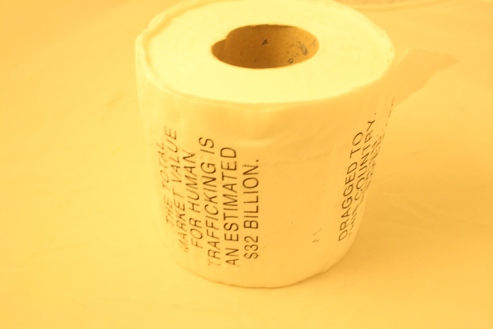
because of the gap you can still read the next fact. So
no matter what you will always be able to read the message.

Here i was focusing more on the text, and putting
LAST in the frame so that it clearly links to the
product and concept. You can read the text on the
toilet roll clearly as well as being able to read the
text on the side of the box. So if you read the toilet roll
and then the side of the box it would still inform you.

This image was showing the other side of the box
with the fact on it. I wanted to play on there being
two facts at once, so no matter what the student
is constantly being informed, by either the box
or by the toilet roll itself.

I especially like this photo, i think its one of my
favorites. This is because having the toilet roll
laid out underneath with a fact, which you can
read clearly, its also underneath the title 'your
informative toilet roll' and so both of the objects
link together. It plays on the whole idea of 'it
does exactly what it says on the tin' which i love.
Simple but effective.
I am really happy with these images and i think that they work really well and i will be using them to create my presentation boards, each image successfully speaks for itself and could quite easily stand alone. Each image shows the different print processes and how both the product and the packaging interact.
Here are images of the toilet roll that i managed to screen print on. I printed on a small amount of the paper but enough so you could pull it out and read each piece of text. Its so good being able to actually have something in your hands and feel it and just generally interact with it instead of photoshopping everything. It just gives more depth to the product.
The screen printing itself, after i did the initial tries, worked really well. Some of the first ones weren't as clear as the last ones but thats because i managed to get a knack for the technique and i was on a roll (excuse the pun!). I took a mixture of images with the toilet roll in order to see what would fit it best.
I definitely prefer the images of the toilet roll standing up, i think they just look a lot clearer and the photographs themselves are actually better. You can read the text but it also just looks like a normal toilet roll sitting on its side, whereas the images taken front on look staged. I want the product to be photographed well but it to also look realistic.
I will be using these image on my boards, i am going to sharpen them up but i am really happy with the product and how they look.


I am so happy! After finding out i could print on the toilet roll yesterday i decided to give it a go myself with my own designs so i have been in the print room all day getting my screens ready to print. Not only did i get to print on the toilet roll but i got to use a print process i really love. The process was especially simple for the toilet roll as it was only ever going to be one colour so there was no need for me to break the image down into CMYK. Below shows the process i took:

The screen i used, i masked off the other text to do
my first trial run. It was important to me to have the
text fit squarely within the toilet roll sections.
With the majority of novelty toilet roll the images/text
tend to overlap over all the sections and the reason
for that is the fact that the machine just prints and doesn't
take that factor into account and it would be very hard to for it to do
that.
Where as i am using a hand technique so i can
afford to be a bit more picky and get my design
squarely in the middle.
Although as i soon found out this was
a lot easier said then done..

Here shows the block of text that i
used first to print onto the toilet
roll.

This was my first print, it worked so well.
You can read the text very clearly, the whole
structure is legible and it fits snugly in the
toilet roll section. The text looks grainy
and is textured which adds more to the
design.

This was the second attempt I had at
printing on the toilet roll. It didn't work
as well as the first, this was because
i pushed down a lot harder with
the 'squidgy'. This meant that more
ink was forced through the screen
making the text saturate and disperse
on the toilet paper. I needed to see how much
pressure i needed to apply to get a clean
crisp block of text, and this test proved
that pushing too hard would ruin the design.

With this test i pressed down very
lightly with the 'squidgy' and as you
can see the text didn't print that well.
You can still read it but it does loose
some legibility which isn't great, and
it looses quite a lot of quality.

This is the next stage i took which was
to print two facts a long from one another.
The first print was done too lightly and therefore
came out a little to grainy, but the second fact
printed perfectly, you can read it and
it is clear. They look really good
sat next to each other, having the same
continuity with colour and size
and text but then obviously using different facts
it gives a nice variety.

Here is the example i made of printing
with the designs in a continuos
fashion in order to get an idea of how the
roll would look flat out. Although the first
two prints weren't great and are very unclear
it gave me and idea of what i wanted the designs
to look like. Each design fitted snugly in-between
the rolls which, as i mentioned before,
is very important to my design.
It was so useful being able to do this and actually put my text into context. You can now get a real feel for what the product would look like and feel like. It also meant that it could be manipulated and bent and it would still hold its shape, which would make it easier to take photographs and i would no longer have to photoshop my designs.
After i was told that it wouldn't be possible to screen print on the toilet paper, because apparently it would saturate and pull apart, i tried again today with some help from a technician from the textiles lab and it worked without a hitch! In order to test we took an already made screen (Hannah Jackson's, from 3rd Year - With her permission) in order to just run the process. It was done using a paper screen as a normal textile screen would have let a lot of ink through and would have destroyed the paper. Then laid the paper flat and using the normal screen printing technique printed onto the paper. It worked brilliantly as you can see. The paper held the ink well, it didn't smudge or tear which is what i had expected it to do. Instead it dried quickly and gave a really crisp image, it showed that i could be as detailed as i wanted and it wouldn't affect the print, or the substrate.
I am definatly going to try and print an example of my designs onto the toilet paper, even if its just the text in order to get a true idea of what the paper would look like.


After the crit today i have come away with a lot of helpful tips in order to make my boards better. this was the main focus of my crit, because i wasn't really sure at all about what to produce or whether what i had produced was clear.
Below is a list of things to do:
- Turn the boards landscape
- Make the type face smaller and take up less room
- Put the logo i developed across all the boards
- Put the original logo design onto the Logo development board, so you can see where i started and where i ended.
- take better images of my products and work them in accordingly.
Here are my mock up boards for Wednesdays final crit. They are only roughly done but they are in the style i want to work with and the have the basic images i am going to use, or similar to and the information i am going to use. I want to keep the boards as simple as possible still tying in with the simple design that i have had throughout my project. I want the boards to be more about the images then the text and be interesting to look at and essentially speak for themselves.

The boards were split into 5, The first has all my concepts on them, broken down with the images and 2 images per concept, this way its setting the viewer up to what the boards are about. I also based the information on what my project is about briefly.

The second board is focusing on what I did in terms of re-branding the LAST logo, this clearly steps out who i am designing for and why, as well as showing the development of the logo which is important because on one board i did want to show my development and this board it seemed more applicable.

The third board shows the billboards i have created. I wanted to use the two billboards i designed on illustrator so it gives the basic over view of what they do and then i wanted to show the actual concept photoshopped using the images I had previously created. It just puts it all into context which is important, I have added information about the print process for the billboards and where they would be used and what they do, just to add more to the billboards and the explanation helps people understand the concept fully.

The fourth board shows the range of posters within the billboard range to be put in places that leeds students go to such as clubs, pubs etc. I think having it follow the billboards is good because you can see where it has been broken down to show the next range and has key elements within it that still link to what is being shown within the billboards.

The fifth and final board shows the product and the range of it. This is the distribution end of my product where the toilet roll will be handed out to students. Again it has taken elements from all the posters and billboard designs and its broken down into something that can be made into a product. I have added a small illustration of a stand that would hold the products as they were handed out with the logo on it to draw peoples attention. this design needs a lot more work but for the mock ups it does give a general idea of what its intended use is.

Here is the layout of all 5 boards, in order.


Here i have decided to take the photos of billboards around Hyde Park corner and turn them into illustration this is because it focuses on the boards and what they do instead of looking at what is going on around them. The concept works on night and day and its much easier and more effective to show this through an illustration. I feel the first two boards are a lot more effective than the last two in comparison the first two look more professional with the lower weight stork compared to the second lots thicker stroke. Also there is more detail within the top tow giving more to the image and it gives clearer difference between night and day. Its good to show a different perspective but i feel the top two show the effect of the billboard more successfully.


UV PRINTED POSTER

UV PRINTED POSTER

UV PRINTED POSTER

UV PRINTED POSTER

CMYK PROCESS

CMYK PROCESS

CMYK PROCESS

FULL RANGE

IN SITUATION - IN UNI SU

IN SITUATION - IN UNI CORRIDOR
After taking images of the posrer production i then went on to put the posters into context (all be it on a very basic scale). The poster range encompasses some that would be printed normally and then the green poster that would be printed using SPOT UV paint. Each poster would be printed lithography style and then trimmed to size. I have edited the green poster using my UV supplies in order to give the affect of what i would look like when UV light shone on it in a club or pub. I feel it is vital to show this aspect as you can't truly understand the affect unless you see it for yourself. All these images need to be re-done for my final production boards but for the mock up boards as they give a basic idea of what i want to achieve.
Subscribe to:
Posts (Atom)