
Here are the layouts for the toilet roll that I have designed. I wanted to do a variety of different layouts just to cover my basis. It was actually really helpful because some ideas that i thought about really didn't work once i had drawn them out. Through this process i have managed to find the layout that i think is most successful and most appropriate to my design. These images cover my whole process from developing then making them neater then seeing what they would look like on the roll of toilet paper.

1. This is one of my favorite designs, its well
centered on the page and you can read it easily.
The logo is nicely tucked under the text and
you can see it clearly when you read the message.
It flows onto the logo and you get both the
information well.

2. I like this design but the text is too squashed
in the corner and you cant see the logo clearly.
Its too separate and doesn't read easily. I wont
be using this design, its too separate.

3. Again the consistency between image and text,
doesn't work. The logo is too far away and
there is a chance they wont see it which would
defeat the point of the product.

4. the text is too squashed in the middle, and would
restrict the readability factor. However i do like the logo
being underneath and centered under the text, the only
problem is it is too small.
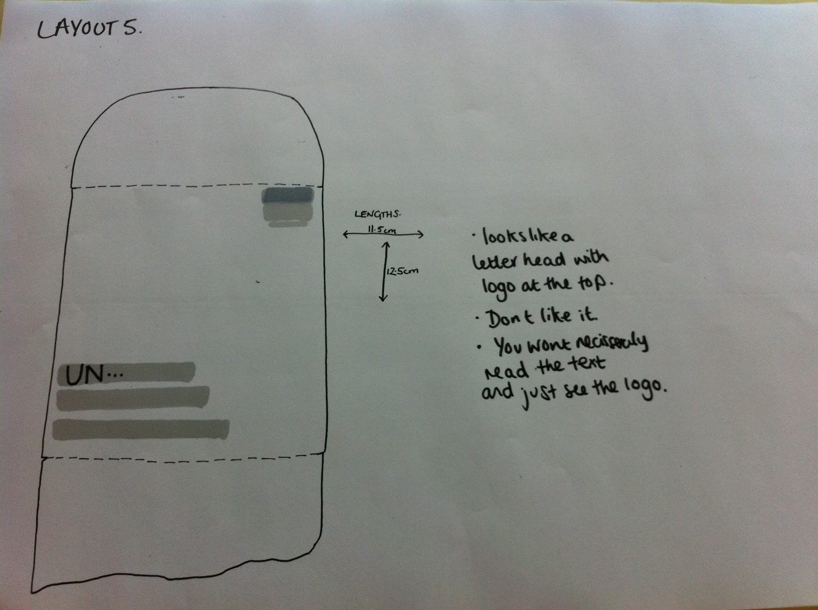
5. This to me looks too much like a letter head, with the
logo being placed at the top of the toilet roll. I don't like
it at all. Also you won't necessarily read the text and just
see the logo.

6. I really like the layout of this because it is centered on
the page, i prefer the logo in the center too. The type needs
to be bigger, just to take up the room and remove some of
the white space. I like the size of the logo and i think the
placement works really well.

7. I did this one in landscape just to try a different
point of view. Its not clear and really doesnt have
the readability factor it needs. Also when the toilet roll
falls down you wouldnt be able to read it clearly.
this idea really doesnt work, but i wanted to try
anyway.

8. This design looks too squashed up at the top
of the page. Its also too small and the logo is too big. The
ratio between the text and image isn't balanced well
at all.

9. There is too much white space with this design
making the readability really hard. the logo
is also too big, it takes up too much space.

10. I don't like the placement, this would not read
easily at all and it would make it look a little
too comical which is not what i am going for at
all.
This is the next stage of my design work, and that was to take the designs i liked most which were 6,4 and 1. They are the clearest of the layouts and they give me enough room to try out my designs and get the text fitted equally so that there is a continuity within the roll.

11. This is way too big and doesnt fit onto the roll
at all, it looks ugly. However it does give me a certain
idea of how big i can go, and how big i don't want to go.

12. This again is too big, i want the text to fit
along the lines equally. The text needs to be broken
down so they fit on the lines seamlessly. Also the
web address cant fall off the page like it is.

13. The text fits a lot better and maybe completely
center it, i prefer the logo along the bottom as
you're reading it your eye is guided to the bottom to
see the logo.
Now i have decided on the layout that i want to use the next stage is to look at in relation to the roll. its important that all the text runs along from one another on the roll so i wanted to see what they layout would be like just in a sketch. This was a useful exercise because it gives me an idea on what it would look like after production.

1. I like this design, everything is
centered which makes it look simple
and sinuous. All the text needs to have
equal spacing. The logo is the right
size it doesnt detract from the text in
any way. The readability is easier
as all the text then flows along easily.
i dont want the text to overlap onto the
other toilet roll this is key to it working.

2. I prefer the logo placed under the text
and you can read on instead of looking
into the corner of the page. The
website is too squished along the side
of the toilet roll paper.

3. I prefer this layout. Everything runs smoothly
from one thing to another. The text and image is balanced
well.
The next stage of my project is to try the toilet roll mock up on screen, just to get an idea of what it would look like and if that goes well then i will start experimenting with the print process i will use to make my mock up. I need to produce this fast and well because it gives me the basis for all my other design work and as i am planning on coming out with a mixture of solutions i need to be decisive and not spend too much time on little things which is what i did last year and wasted a lot of time on it. I want to try and produce my work to a professional standard and therefore i need to focus on the outcome and work from there.
0 comments:
Post a Comment