
Here i have added more information to my packaging. I have used my favorite bits of info that i developed. I really like the simplicity of the message and the text, and still in-keeping with the helvetica design for the text. I have also incorporated the sprays onto the text as well, altering the hue slightly to give it a different effect and make it a little darker. I want the colours to be the same across all the packaging, instead of having some info in one colour and some in the other. I don't want to use loads of colours because my design is idea is to make it simple.

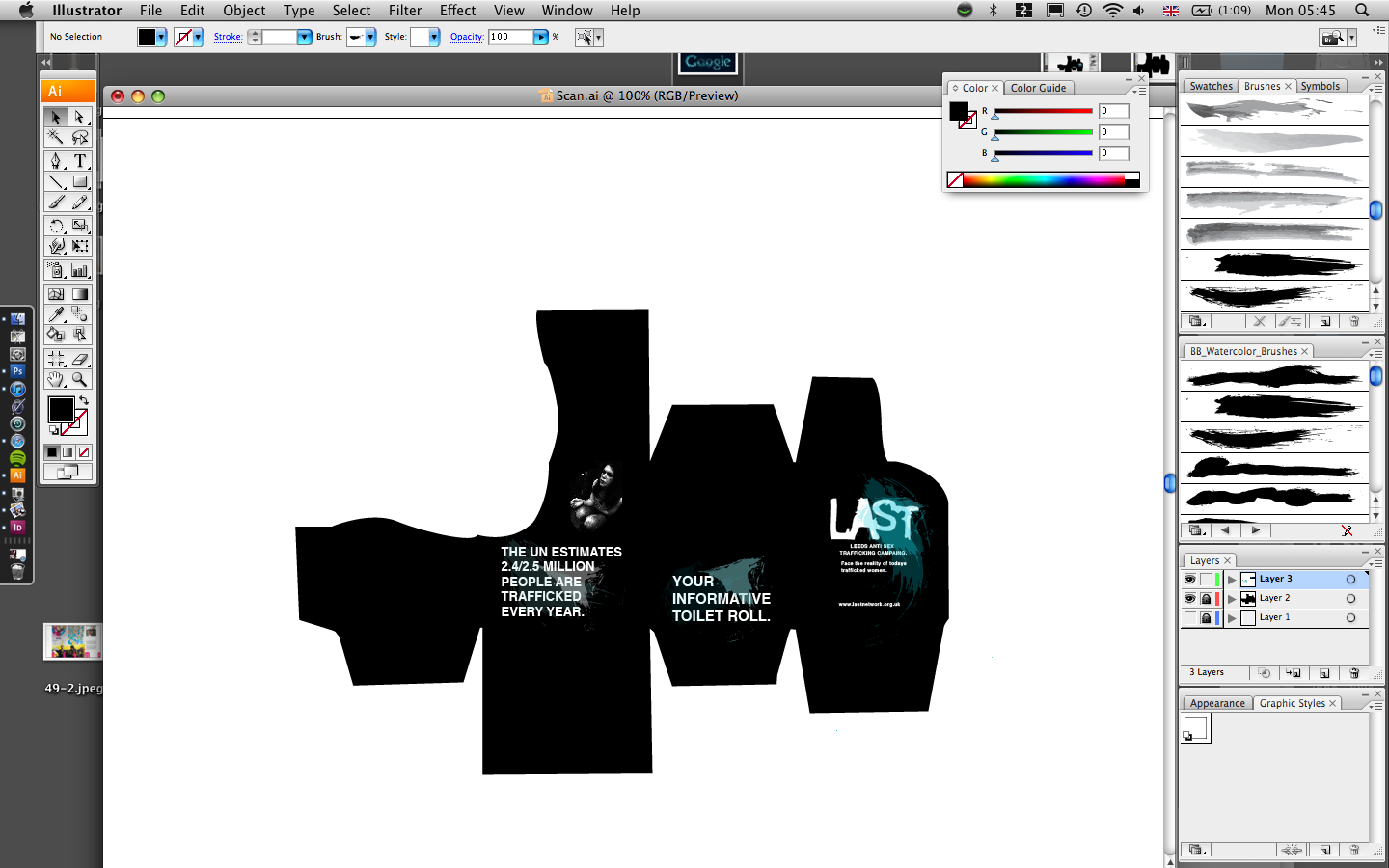
On the last side of the box i have added a quote from my stats and statistics because it then shows you what this product is about. I have also added the spray effect again, it really highlights the message and makes it stand out. The quote on the box is similar to the quote on the toilet roll so that it all links and has some continuity. I have also added an image from the images i took for 'wrap it up', this just gives the box something else to it, and by seeing a person on the side of the box it just helps reiterate the message i am trying to send without scaring people off. I really like this design, and it does everything that i want to do, and i think in order to have a diverse range i am going to use this design as a template to create the range by altering the colour and the message on the side of the box. That way the shape is still the same and the text style but the information changes.
0 comments:
Post a Comment