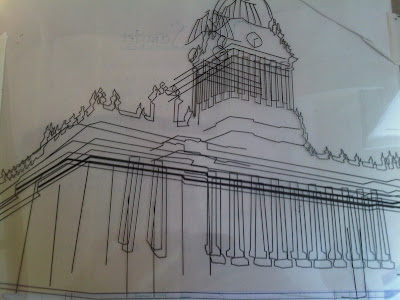
As i mentioned in my brief i wanted to tackle screen printing with this project seeing as i had just learnt how to do it and thoroughly enjoyed it. I chose the image i wanted to use, and set about setting it up for the print. The reason i chose the image below was because it was large, there wasn't too much detail, but enough to test it and i could move it around in order to get a variety of different prints.
With my screen printing i was going to test the colours and see what was the best paper to print on. I was going to use smooth and watercolour, just to see which transfers better. All the designs i would be printing would just be mock ups to see what the ink would print like, see how was it was to make the screen and what the colours would look like.

Screen Print transfer.
 After going through my previous development work i decided i wanted to use similar colours to the pink and green building. If anything make them a big stronger in order to get a more striking image. I made the pink colour a more vibrant red, and i managed to get the turqoise colour pretty much spot on. My only problem was i didn't want to use black as the outline, because i thought it was too harsh against such bright colours and wasn't very in keeping. So i decided to try a dark purple. the only problem was once i had tested it, it actually turned out the purple was extremely light so I had to chop and change around the colour scheme and use the red as the outline and the purple as the detail. I was/am really happy with the colour scheme. All the colours play off each other well and not one gets lost behind the other. I am glad i made the pink brighter especially as i was now going to use it as the outline, which meant it had to be fairly striking.
The Final Screen Mock Up Prints.
These images just show a selection of prints i did. Some have a variety some don't. The main reason i am looking at these is to see if you can see the difference between the papers, which unfortunately is lost on the computer. however i did do some close up shots in order to see the different textures.


-Watercolour. I really like the design printed on this paper. The ink seems to blotch though which doesn't quite give the crisp image. However i really like the texture and the fact the paper is quite weighty so you actually feel like you're holding something. I think the paper i used was too dark though which didn't help in making the image any clearer.
 - Smooth Cartridge. This paper is probably the best. It picked out the detail and the crisp lines perfectly. The image was transfered very well, and has held its vibrant colours. I like the smooth paper, and although it lacks texture the image speaks volumes.


0 comments:
Post a Comment