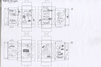
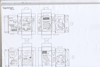
After learning the layout technique that Lorenzo showed us, i thought i could use the technique to work out some layouts for the box. It was really easy to do, just photocopy the box layout and then put the images and content onto the scans. Also it was useful that i had already worked out the information and content, because then i could just play around with the illustrations and type. In total i did 8 different layouts, with different amounts of detail on and these two images below show the best ones, or the ones with most room for development anyway.
In the end i decided to use the last two illustrations, this was because there was plenty of room for development. The images spaced well equally and there was a good balance. In contrast to the first image they are hectic and there's too much use of the space making it unclear. I prefer the layout where you can see the cloud characters more clearly, it gives some depth to the piece and the product takes on the shape of a character itself.
The next stage is to take these layouts and put them onto the illustrator and work them around to get the best fit. I found using these layouts really useful, it really helps you gage where the potential is.


0 comments:
Post a Comment