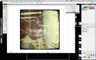
Here i have used the image where Helen looks vulnerable, and using the idea of her being trapped behind bars. I've done this by placing the type alone the edges of the net, to replicate the bars affect. When it unfolds you see the type and the image and it will hopefully give off the impression of her being trapped. Also by keeping the lines it means people can fold it back up easily. I have decided to keep the front side plane so that when you open it, it shocks you as you won't be expecting it.
1. With this example the type it too thick, and it blocks
the image. Its not the right colour either, at all. It doesnt
give off the grimy look that i am going for. I have layered the type on-top
in order to give it depth, i think it does work but no with the
size of this type or the size of the stoke.
2. Following the previous example, i have changed the
stroke of the type to make it thinner and easier to read.
It does work a lot better, however the colour is still wrong.
3. I have made the type white and changed the
opacity in order for it to blend with the image. It means
the image is clearer and instead of looking at the
type straightaway yo see the image, which is good but
im not sure its the effect im actually going for. Again the layering
works well here because it does give it some depth.
4. Here i have developed the 3rd one and made the stoke
marginally thicker so instead of seeing the image first,
you see the type which helps with the idea of helen
being trapped being bars.
5. i particularly like this idea, it works more on the
idea of helen being trapped. the image is trapped behind the type
and helen is trapped in the trafficking
industry. By keeping the type faint over the face
you can still see the lost and vulnerable look on her face, which
works well with the type. This is definitely one of the designs
i will consider for printing.


0 comments:
Post a Comment