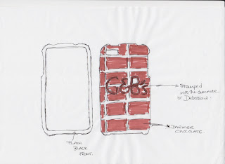
Today, after our talk it was my responsibility to put some initial ideas together for the promotional case for the iPhone. This was our plan for the viral marketing with our campaign. My plan was to take the basic shape of the iPhone and make some rough ideas around that.
There are certain things you cant change with the design of the iphone. Firstly there are certain things that need to be accessible at all times and these are:
power button
mute button
volume buttons
charger
microphones
headphone jack
camera
This first design is working on just using the G&B logo, debossed on
the back of the phone so it gives you more of a texture. Im not sure about the whole chocolate background, i just think it may look a little cheap.
This is taking the bar of chocolate and transferring the design straight across onto the iPhone. It would need to be simplified so that there wasn't that much across it. I quite like this idea because it would mean you could do a possible range.
With this i switched where the name of the chocolate bar is an i have added the chocolate peeled affect. Im not sure i like this design i think theres too much going on and it doesn't really seem to give that classy look that I want.
This is a very simple design which is to have a blacked out back and the gold printed brand logo onto the back. This is the same for the above and below design. This gives the idea of simplistic and classy, which Green and Blacks have described themselves as being.
The above design is taking elements from both the revealed chocolate and the classy design. I have combined them because i think together they could work quite well. By having the chocolate showing it would give you a constant reminded of the chocolate and it would mean that people would see it and want it. By having the logo, it would direct them straight towards the luxury chocolate they should buy. This all needs investigating but i have decided to try a range of chocolate bars transferred onto the phones and the classy look.
PACKAGING
I have also been looking into some packaging ideas.I have done some research into how iPhones are already packaged and one there are a variety of ways. The ones i most like are the boxes, and the clear plastic rectangular box that wraps around the product. I think with both these designs i can edit them to fit my product and it means i can re-package them in a way to suit the brand.
These concepts are just based around the box that you get the iPhone in. Its recognisable and its large which would be good, because it would feel bulky and have some substance. I want to have some room to do some more packaging design and designing an appropriate box that incorporates the brand identity and info, would really help move the campaign.


0 comments:
Post a Comment