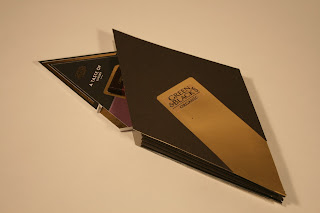
After taking hundreds of pictures we decided to go through and pick the ones that we thought would be most applicable for the boards. By this point we knew what sort of angles we wanted and what we wanted to show.
this angle shows the pattern of the bars that can be created.
it also shows the texture of the bars, and how they would shine
in the light. It also showcases the range well.
This next picture is of a slightly different angle, showing
the length of the bars and the pattern. again showing
a diverse range. The light reflects off the surface well
showcasing the shine well, especially on the milk
bar.
This is a closer shot, we were trying to get a good shine
off the surface to show how exquisite the product is.
We really liked the pattern of created within this shot,
it showcases the range in an attractive and symmetrical
way which would really attract the eye.
This image is of a one chocolate bar, it shows the detail
and the light refracting off the surface.
This is a range of the chocolate bars together. It has an
interesting view and really shows the designs well.
Its interesting angles show different depths to the product
which is good because it shows different aspects all in one.
Above and below: These are the two shots we have chosen to
show the best view of the packaging. It shows the light refracting
off the surface as well as how the product would interact with the bag.
Below are the a selection of the chosen images photoshopped so that they could be transfered onto the boards. With a clean and crisp edge the images really stand out especially against the white background we will be using on the boards.


0 comments:
Post a Comment