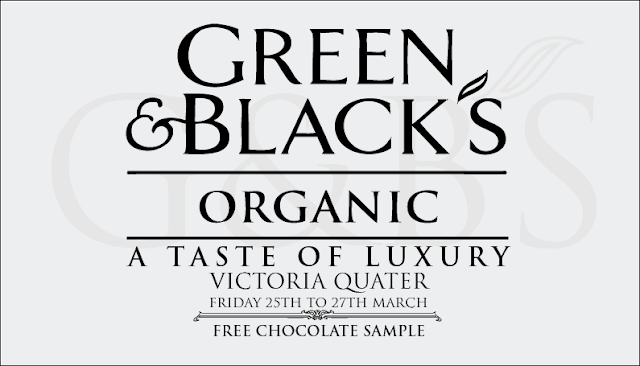
After showing some of my fellow designers and Nick everyone agreed that the more centered layout was the best, and I really agreed with them. It has a function, its readable and legible. It looks luxurious and is visually engaging enough to attract peoples attention.
I have started to edit the layout of the ticket, just to get things to fit better and look more plush. I have changed the point size of the 'free chocolate' and changed it from regular to bold to help make it stand out, but i still think that it is a little too small.
I have changed the type again the regular to see whether it flows better and would be read easier, but i think bold does work better. The kerning and the size of the lettering need to be altered so that it squares of better and looks perfect. But at the moment this is exactly the style i want for the tickets.
This is the final example of the ticket we may produce. I haven't finished tweaking with it by any means but at least now i have a skeleton to start working with and changing so as to give it some visually engaging body.


0 comments:
Post a Comment