
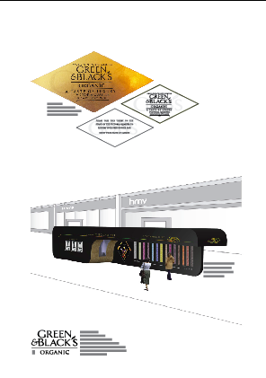
The second board is all about the retail outlet and the promotion to get people to go and interact with it.
This first board works well. The information is clearly laid out.
The images striking and speak for themselves. The ticket shows the relation
it has to the retail outlet. This is a strong board because it does exactly what we wanted
it to do.

This shows the symmetrical pattern i am trying to create with the
brand logo and the information so that it is all in-keeping with the
style of the concept.

I have enlarged the images of the tickets but i don't
think they work, the center of this board is all about the
retail outlet, and on the first boards the tickets could be read
and see and it helped shows the direction of the board. But using enlarged
images of the tickets distracts from the concept of the board.
0 comments:
Post a Comment