
After the crit we had to revisit the tickets. One of the main things i had missed was putting the exact secondary logo onto the back of the tickets, which was good because that had been pointed out to me.

This is the secondary logo that green and blacks use, its Trajan pro edited. They use it on their chocolate bars on the separate cubes.

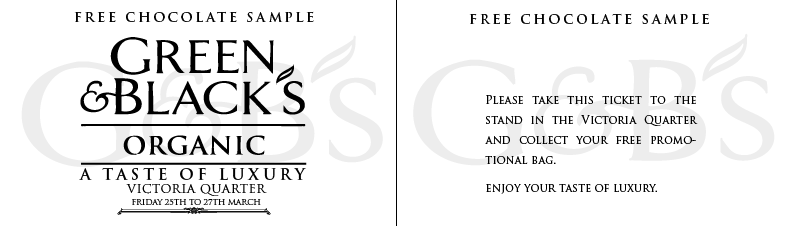
I realised that the free chocolate sample had to be a lot bigger because people needed to see that and realise what they were getting. It was too small on the previous designs. By placing it along the top helps you read it straight away.
Also one of the things that was pointed out in the crit was that the ticket was not as clear as we thought, people thought we should make it more obvious about what the ticket was for. So i decided to double side the ticket so that you it had the information about what you did with the ticket and how to get your free sample.
Here are some layout tests. This first one the point size is small and is centered on the page overlapping the secondary logo. The type is legible and is squared off which looks visually engaging.
I tried putting the text along the bottom and slightly larger, but it doesn't look symmetrical which is kind of uncomfortable to look at.

I have changed the information on within the text, changing it so its a little more 'fun'. I have taken the first layout and edited it slightly.

Lastly with this layout i made it larger so that it takes up more space across the secondary logo. Its also justified so kit fits squarely.
0 comments:
Post a Comment