This was probably one of the most helpful crits I've had this year. I really wanted to focus my feedback to my presentation boards, their images and their layout. These boards were never going to be the final boards, but i wanted some perspective on the images I have and how people thought best to represent them. Amy's feedback was particularly helpful because it really took my boards apart in a very constructive way. I will defiantly be acting on all the feedback i got, like looking out for typos and making the boards landscape.


_________________________________________________________________________________


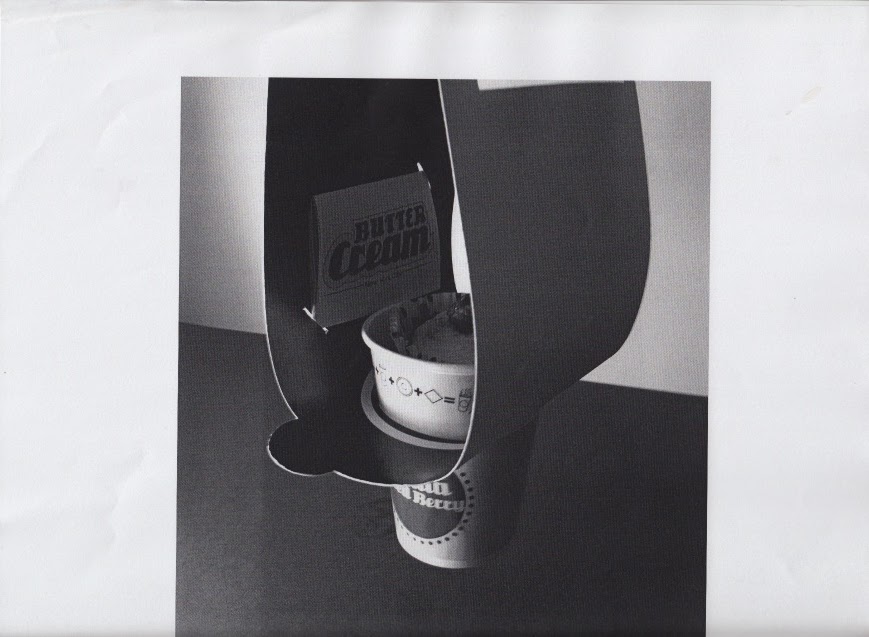
BOARD 1


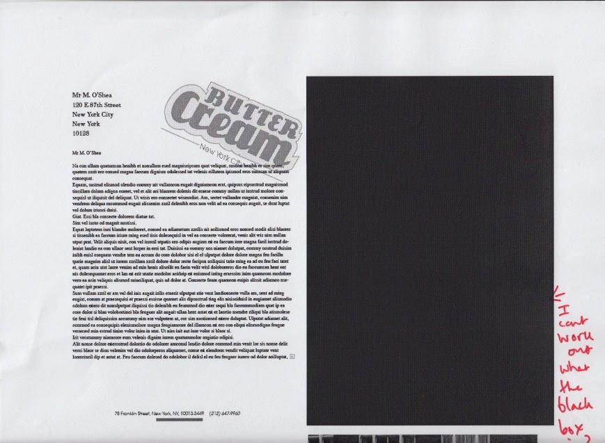
BOARD 2


BOARD 3

BOARD 4


BOARD 5


BOARD 6


BOARD 7

BOARD 8
__________________________________________________________________________________
Things to think about and change:
Board being landscape
Restrict the amount of image displayed
limit info
try to create grid with images
check alignment, not center aligned
Close up shots work
Appropriateness of images - are the all needed?
Re-take images
Try layouts out first
Check spelling
0 comments:
Post a Comment