
I have put together some sachet try outs with the square design I have tried. Just to get some idea of how it would look with the logo and colour. There is only so many layouts I can do with such a small size content and restricted space.

(Cappuccino - spelling error)
I have taken the original pantone and reduced the opacity
in order to give it more of a creamed look which matches the colour
of cappuccino. Its just a simple touch to make the packaging relate
more to the content. I realised having the bright bold colours for everything
didn't really work, and by taking a separate element this makes it more
relatable and appropriate to the content.

Here I have taken the pantone for the chocolate
colour and used it with this packaging, I wanted something
that represented the dark taste of coffee, while still being bright.
I really like the contrast of the cream and brown it really works well
to make the logo stand out against the background.

new colour choices for the
range of hot drink selections.
Still holding an element of colour
but this time with a bit more of an
appropriate colour choice.

Initial colours in a set.

After stepping back from the screen the ultra light
avant garde was a little unclear so I have made it heavier
by using bold italics, this just gives it more definition and
adds to the legibility.

Using small caps to add to the hierarchy and it
stand out a little bit more than usual. I want the
flavor to be legible in a small size. I have kept
the point size up, not going below 8pt because
it still needs to be readable.

Using the Avant Garde to make the subheading.
I have already used this font within previous products
so it makes sense for the rest of the products to have
that element within it.
Closer shot of the layout. Its important that the
logo draws the eye and by having it quite
large it will grab the attention. Then by having the
sub heading of the flavor in a different font it will
play on the hierarchy given by the logo already.

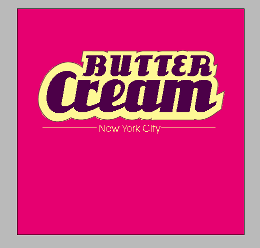
Initial layout for the sachet. I want the logo to
be the forefront of the packaging. So again
the branding element comes into play. By having
a bright colour the logo really shines off the page
grabbing the consumers eye.
0 comments:
Post a Comment