
Lastly was designing the page for the News. Again i tried to make a fully laid out page on photoshop, so that i could then easily insert the page into the website and it would sit there exactly where i wanted it. Instead of miss judging tables and lines, which is quite easy to do.

Here is the photoshopped layout of the page for the news.
I have taken the same colour scheme that I had for the services page,
by having the different colours it highlights the latest news
and then the old news eventually fades out.

______________________________________________________________________________
Once I had finished the services main page i then put together the corresponding pages to the tabs. It was actually relatively easy to put these together because I had all the information sorted, it was just a case of putting it all together.

Lastly was the page about the environmental design
we would produce. Again i chose some very different images,
that way you get a sense of what can be produced. I think
by showcasing a range it has the same impact as if you were
looking at a set like the previous pages.

The next was all about signage, and the carrying different
styles of signage that we could produce, and the standard.
again showing the versatility of the company and how we would design.

The next page was about retail graphics. I decided to
use a variety of different strong images so that it showed
a variety of different styles of retail graphics that we
could deliver. So that it's clear what we can produce and
what standard. It shows the versatility of the company.

The next page was all about packaging, I chose images
that would represent packaging at its most innovative. I
really wanted the images to be clear so that it was fairly
obvious what we would produce. A simple but effective page.

The first page was linked to the corporate identity page.
I chose some really sophisticated and crisp images to outline the
products we would produce. I wanted to show some work of a very
high standard so that it would have visual impact straight away.
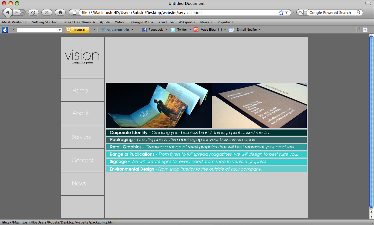
The main page, with the tabs for navigating the website.
0 comments:
Post a Comment