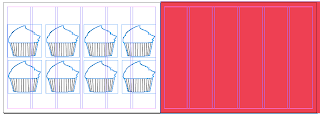
I decided to put together a loyalty card as part of one of my proposals. This would be part of the promotional pack that would entice new and existing customers to come back to buttercream. It gives me another opportunity to work with the branding, and put it into another range and context.
It would be available in a range of 3 colours, taking the main colours used throughout the project, again linking back to the branding of the company.
Taken the logo used already for the cupcakes and
simply transfered it over onto the loyalty card to represent
the stamped area.
Looking at loyalty cards I have deduced that on average they have about 6 to 10 slots for people to be stamped and filled in. So i decided to do an average between each making it 8. This is quite an easy and realistic way of filling them up. It would be a double sided print, one with the info on the back to be stamped and the other consisting of the logo design.
I tried a few different ways of creating a small stamp. Taking my inspiration from 'Shakey Jakes' loyalty card they just used their initials. This is a really simple way of illustrating the brand but I personally think it works well which is why I have brought it into my project. Taking the initials I then played around with the framing around it. It defiantly needs something because it needs to stand out on the card.
Looking at the designs i think i need to use the ones that are blocked out this is because i need them to cover the illustration on the card already. and by using the lined stamp it may get confused as to which is which and may not be that clear.
With regards to the outline I really prefer the designs with the thicker outline, it just matches the blocked out text and looks a lot more vibrant. Its eye catching and clear.Taking the chosen stamp I then worked out the colour scheme to match the back of the loyalty cards. Seeing as I am going to use the primary colour scheme with these loyalty cards.
---------------------------------------------------------------------
The next stage was to look at layout. I already had an idea of how I wanted it to look, I want it to be simple and not overly complicated. with the use of the vibrant colours there's no need to have anything too eye catching because the colour will do that itself.
Here I tested out placing the stamp over the little illustrations.
This is really clear and they stand out really well, which works because
i wanted it to be eye catching and engaging.
I then decided to put the loyalty card on the back so it works
like a business card. By changing the kerning to square
off the layout.
I also added additional information, just a simple tag line
that would illustrate how the card works and what
the consumer would have to do with it.
I then took the logo I have already created and transfered it
onto the front of the card. I was constantly thinking about how
this would be seen when you took it out of your wallet or purse. You
would want it to immediately grab you, which the colour does. And
then adding the logo this just clearly states what the product is about.
Simple but effective.
These are the range of colours I have chosen for the product.


0 comments:
Post a Comment