
To best outline how the whole packaging works i decided to add a vectorised sequence that outlines each function of the packaging. I think it gives it a bit more of a visual and people can get the real interaction out of the cup which is good. I wanted to keep the symbols really simple and clear so that they can easily be followed. Bit of an idiots guide really.
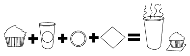 |
| Cupcake + Cup + Coffee + Napkin = Lunch Break That is the basic gist of the packaging. I think the images are fairly self explanatory once you open the cup and see what's inside. I am a lot happier with this because it gives a much better level of interaction compared to before. |
 |
| I tried a different layout here, experimenting with the idea of displaying all the individual elements that make up the packaging. I like this but i think it may look a little unclear. And a little over crowded. |
 |
| I also though about adding type to it, my main problem with this is the fact it would be quite small and therefore the legibility may be lost. I also think its a little too much. the simpler the better. |
 |
| Here I have taken away the type because it was too crowded. Instead I have added a simple 'C' that will go on the packaging too in order to outline what it is, it relates to the coffee and is easy to follow. I think this works much better its still simple but the added C gives it more of a structure to follow. |
0 comments:
Post a Comment