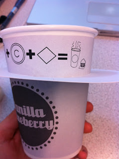
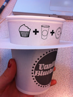
I wanted to check the diagram to see that everything fitted and was being too squashed. Its important that it is still legible because thats the whole point of a diagram.
the smaller version is a lot clearer I like how it
all lines up with the logo below. So that it all sits
nicely and when you view it, it all sits clearly in
the line of vision.
Really not sure about the bigger print off. I think it looks really ugly.
A little bit childish too because it is so large. The fact that it doesn't line up
as well is quite annoying. It just isn't right at all so I wont be using it.
If i print on the cups then i will use the first design its a lot easier to read, it looks a lot better and fits with the rest of the design on the wrap around.


0 comments:
Post a Comment