Photography Selection

Wednesday, 23 March 2011

After taking hundreds of pictures we decided to go through and pick the ones that we thought would be most applicable for the boards. By this point we knew what sort of angles we wanted and what we wanted to show. 

this angle shows the pattern of the bars that can be created.
it also shows the texture of the bars, and how they would shine
in the light. It also showcases the range well. 

This next picture is of a slightly different angle, showing
the length of the bars and the pattern. again showing
a diverse range. The light reflects off the surface well
showcasing the shine well, especially on the milk
bar. 

This is a closer shot, we were trying to get a good shine
off the surface to show how exquisite the product is. 
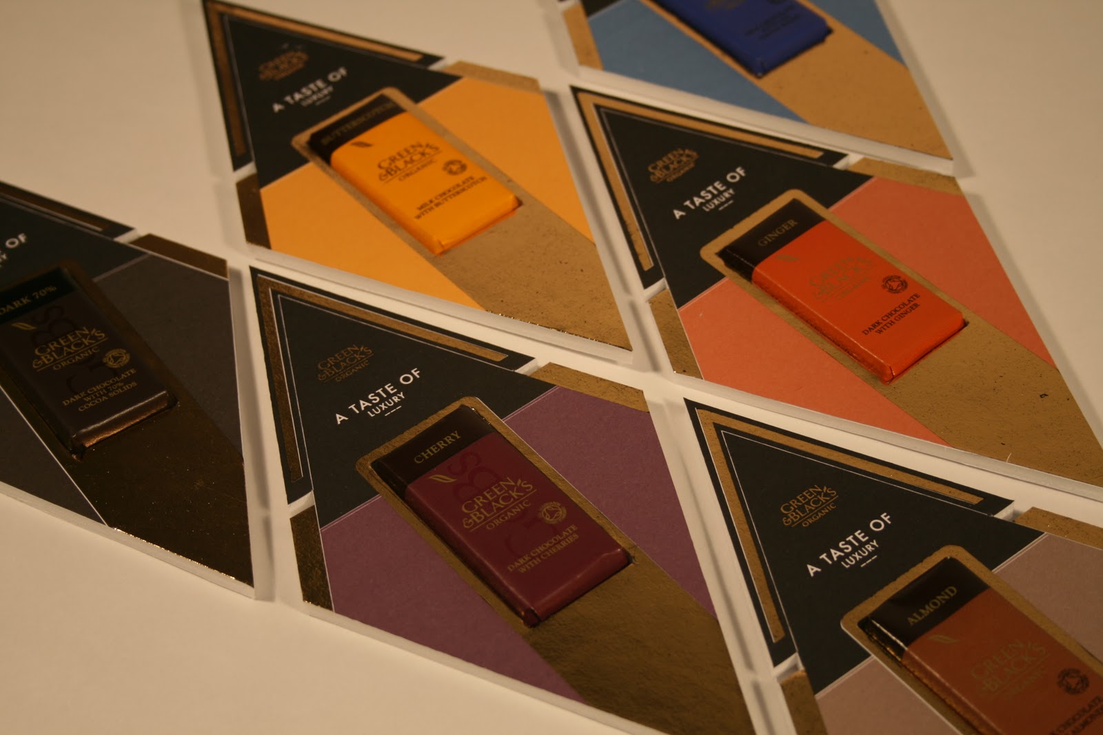

We really liked the pattern of created within this shot,
it showcases the range in an attractive and symmetrical
way which would really attract the eye. 

This image is of a one chocolate bar, it shows the detail
and the light refracting off the surface. 

This is a range of the chocolate bars together. It has an
interesting view and really shows the designs well.
Its interesting angles show different depths to the product
which is good because it shows different aspects all in one. 
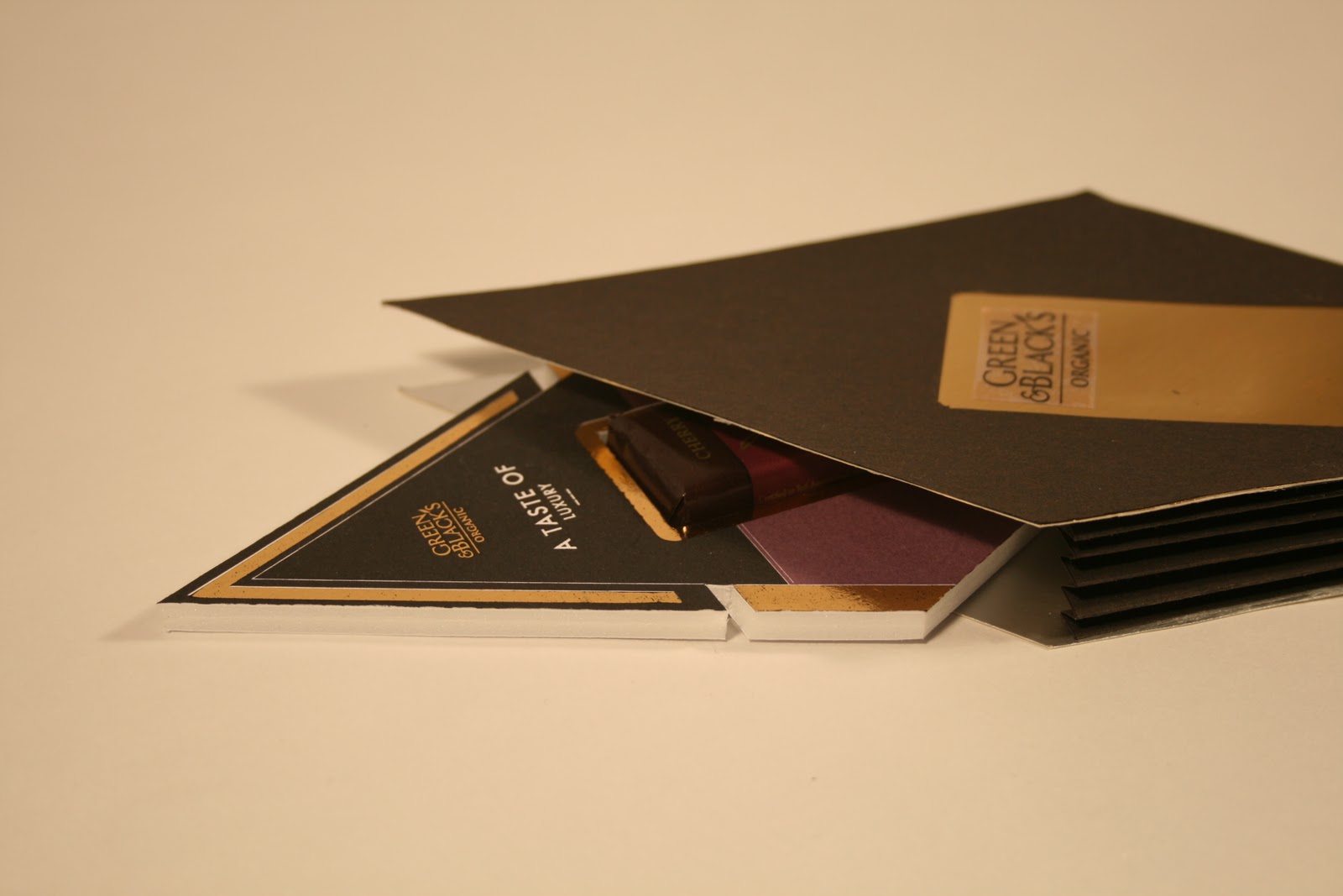
Above and below: These are the two shots we have chosen to
show the best view of the packaging. It shows the light refracting
off the surface as well as how the product would interact with the bag. 


Below are the a selection of the chosen images photoshopped so that they could be transfered onto the boards. With a clean and crisp edge the images really stand out especially against the white background we will be using on the boards. 


Photography seshshwon

Today we had a photography session to try and get some really good shots of our mock ups. Below are some of the set up shots for the photo shoot.


Mock up images of new Mock up


These are a selection of images from the new mock up for the packaging that i've made. I have taken these images just to see how it will look and what best angles to try and take the proper pictures at. I have also managed to add the promotional packaging to the mock up so that it actually puts the piece into context. This isn't the best mock up in the world, but providing we get some good shots i think it will work and help illustrate what we are trying to create. 

Presentation board 2

The second board is all about the retail outlet and the promotion to get people to go and interact with it. 

This first board works well. The information is clearly laid out.
The images striking and speak for themselves. The ticket shows the relation
it has to the retail outlet. This is a strong board because it does exactly what we wanted
it to do. 
This shows the symmetrical pattern i am trying to create with the
brand logo and the information so that it is all in-keeping with the
style of the concept. 

I have enlarged the images of the tickets but i don't
think they work, the center of this board is all about the
retail outlet, and on the first boards the tickets could be read
and see and it helped shows the direction of the board. But using enlarged
images of the tickets distracts from the concept of the board. 


Presentation Board 1

I have put together a variety of layouts for the first board. I have taken the information that we originally put together for this brief from the boards we have used in other crits. We decided that we would create  board that would soley be about our concep and our brief, to initally show our idea and how we planned to tackle the brief. This way it sets out a guidelines to what is being presented on the boards.  
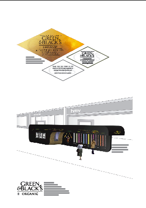
This first layout it purely about the information. It shows
the concept and style in a clear way. Although i think the type is 
too big. We both wanted to use a sans serif
font on the boards so that it contrasts against the font used within
green and blacks. I decided to use a simple and thin font, so the
type was clear against the background and could be read easily. 

I thought it may be important to use an image
on the boards so that it engages the viewer straight away.
The pattern for the promotional packaging is visually
engaging and would look striking on the page, so i put it in the
background. The only problem is i know that we are going
to be using this image again, so it may not be good to have repartition. 


I have changed the layout so there is a bigger hierarchy on
the page, Im not sure whether this is right it looks like there is 
a little too much going on, so the eyes not sure where to look
and also how the images are applicable. 


I have added information along the bottom that outlines what
is going on the page. I like the symmetrical pattern that this creates
and i think it looks good on the page. although the information isn't correct, 
because there needs to be more.  

I have taken away the vector image leaving the information
and the pattern on the page. I like the idea but im still not sure
about using the pattern in the background because of the repartition. 


With this last try i have split up the text so that it
is spread across the page. I quite like this, but i think
the gap is too big and again the image needs changing. 

So, what i can take from these mock ups are i like the information itself, with regards to the concept and idea. I know there needs to be an image on the boards but im not sure which yet. I also like the information at the bottom of the page, well the layout anyway. I still need to try some more ideas. 

Template Layouts - Presentation Boards

After tuesdays crit on our presentation boards Nick and I decided to go through the exact style that we wanted our boards to be in. We knew that we wanted them to be simple and essentially let the images speak for themselves, providing basic information to outline the concept and what's going on on the boards. 

This first board shows the layout for the tickets and the retail outlet. Putting them on the same board would mean that they run together, it shows it in a step by step way.  With the logo and information wrapped around each other on the bottom left corner. 

This second board would showcase the pattern created by the promotional packaging and it would also show the packaging in context. Essentially this board is all about  the promotional packaging. Again information on the bottom left hand corner. 

This next board would be showcasing the concept for the promotional bag showing elements that would go inside the bag as well as the context in which the bag would be used.

These are only rough ideas as to how the layout will look, but it helps give some structure to what we want to have on the boards and how many images etc we will need. 


Bag mock up

Monday, 21 March 2011

I have done a simple mock up for the bag. This will not be the final mock up at all, but i have done it just to check that it would work. This bag is not to scale. I have taken shots of lots of different angles so that you can see how it would work and how it would hold the promotional products. 
Complete front view, showing shape and style.

Side view showing concertina fold holding it all together.

Top of concertina fold, showing inside the bag.

Reverse side showing inside the bag again.

Top shot, showing inside the bag from the top. Shows
depth.

Showing inside the bag, the style and how it would
look and fit together.

Closed end, bringing it to a point again adding textural feel
and different style. 

Side view, showing length and style.


Slight 3D image of the front, showing clearer depth.

Concertina side view.

Side view with larger angle showing the width.